I’m always on the edge about this one. Imo web components would do better by working more with the dom. That should actually simplify their usage (mapping to standard html essentially), but it certainly isn’t as simple from the web component implementers pov. Though really you’d need to regularly check attributes for changes just as much as you’d need to check nested markup.
The reason why we didn’t do that much in the past is because that required shipping a compiler to runtime (see early days of vuejs, where people did that for a short time). But with web components being a standard we don’t need to treat innerHTML as useless for passing in data.
Fortunately custom element lifecycle callbacks let you know when the component is mounted, unmounted or the attributes change. Note that the inner custom elements do not live in the shadow DOM of the parent as the child has its own shadow DOM. It’s basically private shadow DOMs all the way down unless you specifically create a component to use the regular light DOM.
The custom element lifecycle callbacks include:
connectedCallback(): called each time the element is added to the document. The specification recommends that, as far as possible, developers should implement custom element setup in this callback rather than the constructor.
disconnectedCallback(): called each time the element is removed from the document.
adoptedCallback(): called each time the element is moved to a new document.
attributeChangedCallback(): called when attributes are changed, added, removed, or replaced. See Responding to attribute changes for more details about this callback.
Additionally there are other events that can be listened for:
The slotchange event is fired on an HTMLSlotElement instance ( element) when the node(s) contained in that slot change.
I’m aware of most of them. I’ve played around a bit with webcomponents when they got support to emulate being a form input (which nicely ties in with phoenix’s form handling).
I added the one line directive at the top to make it a custom element. That’s all there is to making a reactive web component with a disappearing framework like Svelte which can be used in any app or framework or regular html page.
I would really like to be able to make my Phoenix components custom elements. This could be achieved by transpiling the Elixir template render and client side event handlers to JS to support both client side and server side rendering of Elixir web components. This would eliminate the need for JS server side rendering and the need for a JS client side framework.
Then as a related but separate concern, use something like LiveState to exchange events and state diffs between the client and server and get full reactivity between client and server, and then with a simple client side state cache and router (literally a few Kb) an Elixir PWA is a slam dunk.
Again I don’t really care about preact signals being an integration experiment that Lit supports when Svelte offers a nicer DX and less boilerplate for authoring components.
Svelte has had compile time reactivity since before V1.0 by analysing the code and use of the $: reactivity statement. Svelte is compiled to generate just the code you write with surgical DOM updates vs a typical runtime heavy JS framework. This is why there is practically zero boilerplate code, it’s just html, styles and any JS you have to write to express computations. The compile time reactivity works extremely well but there is always a ways to improve things.
Svelte 5 is moving to its own signals based implementation but this is an implementation detail and not something the developer actually uses directly. Again DX is the focus in Svelte over boilerplate ceremony of other frameworks.
The future of Svelte 5 reactivity is described below:
So its directly styled with tailwind classes. But is this still possible when they are WCs?
Or would I have to create each button-style beforehand (or add some logic to override colors etc)
Yes. You can style the bits UI components because they provide a class property for the component user. Styling is described here.
The styling in the bits-ui documentation is only example usage. Being headless components they do not do any styling, only interactions and html accessibility.
That’s why shadcn-svelte is literally a copy and paste collection built on bits-ui with a base tailwind theming layer with some design tokens. I would also suggest following the shadcn-svelte approach for default app theming and keep style classes out of component wrapper code. This is especially important in a library, so it allows the theme to be specified by the user in Twilwind layer and also allows all the tailwind classes on elements where they need.
Interesting conversation! While evaluating Carbon UI, I had a brief look at web components with LiveView a while back.
What’s the browser testing situation for web components like these days (with a tool like Wallaby)? I remember there was a PR in progress to support shadow dom queries in Wallaby: Shadow dom by superchris · Pull Request #728 · elixir-wallaby/wallaby · GitHub. I’m guessing you’ve implemented something like this locally @superchris? I prefer my tests to not leak implementation details, but I guess there’s no getting away from it… I’m assuming you’d need to do something like querying into the shadow root to say populate a text input that is wrapped by a web component.
good point. If the strategy of a dedicated phoenix WC-lib would be taken one could add a debug mode in the components that render info for testing into the light-DOM. Could even make testing easier. (“normal” functionality in the shadow, just debug stuff to test agiainst in the light)
Well I’m using carbon as a “product” so my testing is not testing their framework but based on what my app use cases are.
When writing my own custom elements then given my preference for zero boilerplate, it’s just Svelte Component tests :
Component Tests: Validating that a Svelte component mounts and interacts as expected throughout its lifecycle requires a tool that provides a Document Object Model (DOM). Components can be compiled (since Svelte is a compiler and not a normal library) and mounted to allow asserting against element structure, listeners, state, and all the other capabilities provided by a Svelte component. Tools for component testing range from an in-memory implementation like jsdom paired with a test runner like Vitest to solutions that leverage an actual browser to provide a visual testing capability such as Playwright or Cypress.
With Svelte you test components as you normally would any regular svelte component using an import rather than using the custom element tag.
But you can’t test the Application like that, right?
How would you test that a component with a specific configuration (hidden in shadow) is rendered using LiveViewTest
The strategy is test each component module separately with unit tests to make sure it honors properties, and events handlers passed and renders the correct dom structure and styles. Pretty much what you would do for a LiveView function component, except it’s JS.
This unit testing could also test the component as a custom element across multiple browsers if you think that your component uses features that may have browser compatibility issues.
The testing of custom elements in your app is basically the same as the integration testing you do when using ul, li, divs, tables and buttons in your markup, your custom elements are just like any other element at that point and treated as a black box.
Beyond the unit testing of a component, I think time is better spent on integration testing of the application.
The idea of headless components based on web components is great, but it is not easy to implement such a component system, at least from what I have tried.
First I want to make it clear that Web Component is a set of different technologies which you can use altogether or separately. It consists of three different web apis: custom element, shadow DOM, template and slot
Custom element allows you to define your own HTML tags and associated lifecycle callbacks for the HTML element
Shadow DOM allows you to create an isolated DOM environment separated from the normal DOM (also called the ‘light DOM’). A shadow DOM tree is usually created and attached to a custom element when the element is mounted. Styles in light DOM won’t leak into the shadow DOM environment and also you cannot use normal styling method (like using CSS selectors targeting a specific class name) won’t apply to the shadow DOM tree content.
Slot API is only available inside a shadow DOM context. It allows you to ‘slot’ light DOM content into the shadow DOM tree.
Since they are three different APIs, you can use them combined or just use one of them in your web component .
And here I want to list some major problems I had when I tried to implement a headless and accessible UI component library using web components for Phoenix LiveView.
Styling issues with Shadow DOM
What @Sebb asked is actually a good question about how styling web components works.
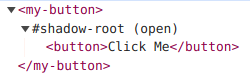
Let’s first think about how to implement a custom button with web component. In most of these JS UI component libs, take Bits UI as an example, the <Button.Root>Click Me</Button.Root> component renders just a single button element, the rendered html would look like <button>Click Me</button>.
But below is how it usually implemented in most web component UI libs (like Sholace or Carbon), the actual rendered html would look like:
The difference is that your actual button element now is being wrapped inside a custom element’s shadow root. You cannot use normal CSS selectors to target the button element, so the following CSS would not work:
my-button button {
  color: red;
}
Also, if you’re using tailwindcss to set a bunch of class names on the custom element like <my-button class="text-blue"></my-button>, you’re just setting styles for the wrapper element, not on the actual button element inside the shadow root. It won’t work either if you add tailwind class names directly to the button element, because all your tailwind classes live on the light DOM style, and they won’t affect the shadow DOM styles.
Here’s an example and you can check the demo online here:
The paragraph element and the button element are both inside the shadow DOM, but only the paragraph text color is affected by the text-blue class. That’s because the paragraph inherits color styles from the parent element, but the button element has default text color set by the browser user agent.
So if you want to style an element inside a shadow DOM, you’ll have to use part attribute and ::part() CSS selector, so that you can target an element inside shadow DOM. This is what Showlace used to allow some component customization, check the Shoelace button customization example.
Other alternatives include using <slot> to slot light DOM element inside shadow DOM, so you can styling the slotted element. Or you can just ditch shadow DOM and just use custom element API, but you won’t be able to use the slot API.
You may ask, what if we just remove the extra <button> element wrapper inside the shadow DOM, and use our custom element as the button container, just like:
Well, then you have to take care of accessibility issues with your own custom button element, since <button> element has default screen reader support and focus management provided by the browser. You will need to add a bunch of ARIA-related attributes to your custom element to make it fully accessible.
Not easy to design a composable and flexible component API
One thing that I like about headless UI is that they’re very flexible and can be easily composed, but it’s hard to acheive a similar component API design with just web compoennts.
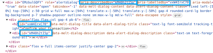
Let’s take the AlertDialog component form Bits UI as an example,
But it won’t work that easily, most of those headless UI libs heavily relies on Context API from the UI framework to be able to share states for all those component parts.
According to the WAI-ARIA Guide, the element served as the alert dialog container should have a aria-labelledby attribute associated with the dialog title element id and a aria-describedby attribute associated with the dialog description element id for accessibility,
We don’t set any of these attributes manually since the UI lib did it for us, and this is achieved by the Svelte Context API, so that the parent and child components can share states. But it’s not available cross different web components, as documented in the Custom elements - Caveats and limitations of Svelte API.
So if you want to achieve a similar component API design for web component, it may require some manual JS-side work.
Client-Side DOM changes and Server-Side DOM changes
Let’s take the Switch component form Bits UI as an example now, for accessibility, when the state of a switch component changes, the associated aria-checked attribute in the switch element should also be changed respectively.
If this DOM change is controlled by JS and happens on the client side, then a following LiveView DOM patch will just overwrite the DOM change, making it return back to the original HTML template sent from the server.
Other examples like tooltip, hover card and popup, these components also involves client side DOM changes, you hover on something, and the associated popup element is set to show, and this is controlled by the JS side. You’ll have to use something like LiveView hooks to sync the client side DOM changes with server side chanegs.
So generally speaking, I don’t think web component is a good choice to build lower primitives for headless component that requires flexibility, since it is initially proposed to create element with functionality and styling completely encapsulated.
From my point of view, web component is good for these two cases:
Build framework-agnostic design systems. Shoelace is the best example, and it provides the most customizable component designs.
And finally, in my opinion, the biggest obstacle to build an accessible component library for LiveView is that, to build components with rich interactions and full accessibility like keyboard navigation, focus management, typeahead support and popup anchor position, and also taking browser differences into consideration, JavaScript is unavoidable. But once we’re managing DOM states from the client side, it finally falls into fighting with synchronizing client-side states with LiveView DOM patch.
This is a really long thread, and I just want to share some of my own experience with Web Components and LiveView. Thanks for your patience if you’re watching to the end.
This is true for all WCs (independent of them being headless), right?
And not only true for aria-stuff.
Does that mean we have to build a set of hooks around every component just to fix that?
That can’t be true (hopefully).
Yes, this is true not only for web components, but for all DOM changes manipulated by JavaScript. Because this is how LiveView works.
For example, for the following LiveView, if we assign the initial count to 0, and increment the count when “inc” event is triggered,
def render(assigns) do
~H"""
<button id="counter" phx-click="inc"><%= @count %></button>
"""
end
First, the LiveView mounts, and sent the initial rendered html:
<button id="counter" phx-click="inc">0</button>
Then, if you use client side JavaScript to make changes to the DOM node, like document.querySelector("#counter").dataset.count = "0", the current rendered DOM node in your browser will change to:
Then, if you click the button and send an “inc” event to the server, the server side received the event and update the new assigned count to 1, the LiveView rerenders on the server, getting the following HTML:
<button id="counter" phx-click="inc">1</button>
And then it is sent to the browser, going through a DOM patch process. So LiveView is not aware of your previous client side changes, your previous changes get lost.
Svelte actually has context support for web components. But the problem here is that, the same context is not available across different web components. And this is true for SolidJS as well.
Lit just stabilized their context API for web components, though. Context – Lit
Wow what a great and active thread! I’ll try to reply to a few posts at once.
Thanks @TunkShif that’s a really long and well thought out post. There’s still a lot of problems to solve, no doubt about it. I think my choice to lean into Web Components really comes down to embracing the web platform and trusting that these problems will get solved over time, rather than trying to invent our own solution that will only apply to our community. I’ve absolutely seen encouraging things happen with things like shadow parts coming along and being rapidly adopted, even if it is imperfect. I haven’t had adequate time to dig into adopted stylesheets, but this might be another styling avenue to investigate.
For your pint @Sebb about changing things in the DOM getting stepped on by LiveView, thats a pretty good reason to keep your components dumb. If they only render their state and dispatch events to LiveView, it becomes easier to avoid problems like this.
And lastly on testing. @dblack I am still, sadly relying on my fork of wallaby. I have kept it up to date somewhat recently, but I really need to work with @mhanberg to get it across the finish line. The fault is entirely mine, I just need to get a few more things addressed and I feel optimistic it can be merged. Thanks for a reminder :). For testing the web components themselves in isolation I have had great success with @web/test-runner. Its worth checking out if you haven’t.


