How to toggle two sets of arbitrary tailwind classes for transitions?

I’m working with LiveView.JS for the first time. It’s one of the features that’s brought me back to LiveView on the frontend, and I feel like it was a critical piece that was missing for the community in earlier versions of the websocket-based paradigm.

By default, Phoenix comes installed with TailwindCSS. In Tailwind, transitions often occur via CSS classes. Take the following example:

<!-- When a menu is 'opened', it should receive the "block" class. When 'closed', it should receive the "hidden" class -->
<div id="mobile-menu" class="block sm:hidden">...</div>
<div id="desktop-menu" class="hidden sm:block">...</div>

This is a very common occurrence in Tailwind - transitions are almost exclusively driven via class addition and subtraction. When I went to try and apply this pattern with LiveView.JS, I was surprised to not see an obvious way to approach this.

The challenge with JS.toggle() is that the display property is directly applied via the style=display: attribute, where tailwind classes are invalid. This causes problems in the reactive example above, because the mobile menu could be toggled to be in the open state (style= display:block), and if the window is resized, this style will override the existing reactive behavior defined in tailwind (sm:hidden), causing both menus to be shown at once!

Of course, you could avoid this by using the JS.addClass and JS.removeClass functions, but that requires you to know the current state of the element to determine which function to call… meaning we’d need to keep state on the server, exactly what we are trying to avoid for something like a menu’s visibility!

I looked over the other functions available in LiveView.JS, but none seem to handle what I imagine must be an incredibly common use-case.

So, please help me out LiveView devs - am I missing something obvious? All I want is the ability to toggle two sets of arbitrary tailwind classes and let the state be contained entirely on the client via JavaScript. If I can do that, Tailwind will take care of everything else.

Thanks for your suggestions!

3 Likes

Your example seems to be empty - was it a copy/paste that didn’t get into the post?

Also, have you seen JS.transition? It supports tailwind classes Phoenix.LiveView.JS — Phoenix LiveView v0.19.4

3 Likes

The post originally tried to use single backquotes on separate lines to quote a whole block of code, which resulted in the code not getting quoted. I’ve replaced them with triple-backquotes ``` which work as the author intended.

4 Likes

LiveBeats uses tailwind and toggles menu and such just fine from TailwindUI. Have you looked there?:

check the <.dropdown> in core components and the show_dropdown and hide_dropdown functions:

8 Likes

Thanks, it was in the mod queue so I didn’t get a chance to review for formatting beforehand :slight_smile:

1 Like

Hey Chris, thanks a bunch for the reply (and for your work)!

I took a brief look, it seems to me like your approach to this problem is as follows:

  1. Create a button that shows the mobile menu (sidebar) on click.
<button
      type="button"
      id="show-mobile-sidebar"
      aria-expanded="false"
      aria-controls="mobile-sidebar"
      class="px-4 border-r border-gray-200 text-gray-500 focus:outline-none focus:ring-2 focus:ring-inset focus:ring-purple-500 lg:hidden"
      phx-click={show_mobile_sidebar()}
    >
      <span class="sr-only">Open sidebar</span>
      <svg
        class="h-6 w-6"
        xmlns="http://www.w3.org/2000/svg"
        fill="none"
        viewBox="0 0 24 24"
        stroke="currentColor"
        aria-hidden="true"
      >
        <path
          stroke-linecap="round"
          stroke-linejoin="round"
          stroke-width="2"
          d="M4 6h16M4 12h8m-8 6h16"
        >
        </path>
      </svg>
    </button>
  1. Inside the mobile menu, have a nested component that is capable of hiding the mobile sidebar:
<div
  id="mobile-sidebar-container"
  class="fixed inset-0 flex z-40 lg:hidden"
  aria-modal="true"
  style="display: none;"
  role="region"
>
  <div class="fixed inset-0 bg-gray-600 bg-opacity-75" phx-click={hide_mobile_sidebar()}></div>

  <div
    id="mobile-sidebar"
    class="relative flex-1 flex flex-col max-w-xs w-full pt-5 pb-4 bg-white hidden min-h-screen"
  >
  ...
  1. Implement the “show” method called by the button in #1 to hide itself.
def show_mobile_sidebar(js \\ %JS{}) do
    js
    |> JS.show(to: "#mobile-sidebar-container", transition: "fade-in")
    |> JS.show(
      to: "#mobile-sidebar",
      display: "flex",
      time: 300,
      transition:
        {"transition ease-in-out duration-300 transform", "-translate-x-full", "translate-x-0"}
    )
    |> JS.hide(to: "#show-mobile-sidebar", transition: "fade-out")
    |> JS.dispatch("js:exec", to: "#hide-mobile-sidebar", detail: %{call: "focus", args: []})
  end

This is clever and seems like a viable approach, but where I think it gets a bit ugly is when you have the desire for a single button to control both the “show” and “hide” behavior of a component. In that case, you’d need to end up having two buttons with most things duplicated, and two methods - something like this:

<button id="show-menu-button" class="block <%= @duplicated_classes %>" phx-click={show_menu("#menu")}>Show Menu</button>
<button id="hide-menu-button" class="hidden <%= @duplicated_classes %>" phx-click={hide_menu("#menu")}>Hide Menu</button>

def show_menu(menu) do
  hide_button("#show-menu-button")
  show_button("#hide-menu-button")
  JS.show(to: menu)
  # transitions omitted for brevity
end 

def hide_menu(menu) do
  hide_button("#hide-menu-button")
  show_button("#show-menu-button")
  JS.hide(to:menu)
  # transitions omitted
end

But I do feel that a more smooth developer experience would be something like this:

<button phx-click={toggle_menu("#menu")}>Menu</button>

def toggle_menu(to) do
  JS.toggleClasses(to: to, in: "block", out: "hidden")
  JS.toggleClasses(to: "#menu-button--icon", in: "block", out: hidden")
end

I’m very open to being wrong about this, because what I’m suggesting is that LiveView.JS should manage the state of the classes for a component. But that said, JS.toggle is already managing this state to determine if it should apply display: none or display: block, so I imagine the implementation would be similar.

What I’m trying to get at is this - as it stands, it looks like JS.toggle is quite limited in use - it requires you to be okay with your component having its display overridden with display: block | flex | inline. In most cases with Tailwind, you really want a specific tailwind class to be applied, and you definitely don’t want your reactive modifiers (sm:, md:, etc) to be overridden.

Very curious as to your thoughts! Thanks again.

1 Like

that’s what my linked dropdown component does:
2023-07-13 14-04-52.2023-07-13 14_05_10

The phx-click-away does the hide which you’ll need for a menu anyway, and the same button acts as show and hide because of that.

1 Like

Also sounds like this is what you’re interested in: feat: toggle_classes (updated 2021/01/08) by nbw · Pull Request #1721 · phoenixframework/phoenix_live_view · GitHub

3 Likes

Note sure if you meant the PR on itself or the workaround proposed in the comments. If the latter, that works for classes, but fails if what you are trying to toggle is something else (like attributes for example).

For attributes, try swapping JS.add_class and JS.remove_class into @Nik’s workaround re-posted below.

def toggle_expanded(js \\ %JS{}) do
  js
  |> JS.remove_class(
    "expanded",
    to: "#outer-menu.expanded"
  )
  |> JS.add_class(
    "expanded",
    to: "#outer-menu:not(.expanded)"
  )
end
1 Like

I tried that, couldn’t make it work, did it work for you? If so I will try to revisit it and see if it was something that I messed up

I got it working when using a class based selector as the condition, but not when using an attribute selector as the condition.

<.button phx-click={accessible_js_toggle(to: ".target")}>

# these two functions successfully add and remove the `aria-hidden="true"` attribute and `"invisible"` class to the targeted elements
  def accessible_js_toggle_1(js \\ %JS{}, [to: selector]) do
    js
    |> JS.remove_attribute("aria-hidden", to: selector <> "[style*='display: none']")
    |> JS.set_attribute({"aria-hidden", "true"}, to: selector <> ":not([style*='display: none'])")
    |> JS.remove_class("invisible", to: selector <> "[style*='display: none']")
    |> JS.add_class("invisible", to: selector <> ":not([style*='display: none'])")
    |> JS.toggle(to: selector)
  end

  def accessible_js_toggle_2(js \\ %JS{}, [to: selector]) do
    js
    |> JS.remove_attribute("aria-hidden", to: selector <> ".invisible")
    |> JS.set_attribute({"aria-hidden", "true"}, to: selector <> ":not(.invisible)")
    |> JS.remove_class("invisible", to: selector <> ".invisible")
    |> JS.add_class("invisible", to: selector <> ":not(.invisible)")
    |> JS.toggle(to: selector)
  end

  # whereas this function that selects by attribute does not work while toggling
  # if set is after remove, then it only gets set; if remove is after set, then it never gets set
  def accessible_js_toggle_3(js \\ %JS{}, [to: selector]) do
    js
    |> JS.remove_attribute("aria-hidden", to: selector <> "[aria-hidden='true']")
    |> JS.set_attribute({"aria-hidden", "true"}, to: selector <> ":not([aria-hidden='true'])")
    |> JS.toggle(to: selector)
  end

Ahh sorry for any confusion, meant to write swapping in JS.set_attribute and JS.remove_attribute!

I would recommend using phoenix_live_react together with headles-ui for rendering interactive components, as handling css transitions in liveview still has much to be desired for anything more complex.

Even then, handling DOM removal transitions of the react node is still quite annoying and would require using LiveView.JS to target the node you’re removing.

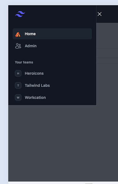
I’m having a weird behaviour when animating a Tailwind sidebar open/close. Starting from a closed sidebar, I’m able to open it with the animation, and close it with the animation as well. But I can do it only once. After that, whenever I click the open menu, it will appear and animate back to the to closed state.

So the starting state is:

<div class="relative z-50 lg:hidden" role="dialog" aria-modal="true" id="off-canvas-menu-mobile" aria-expanded="false" style="display: none;">

Once I click to open, the animation triggers, the menu is opened and funcional and the state of the div becomes:

<div class="relative z-50 lg:hidden" role="dialog" aria-modal="true" id="off-canvas-menu-mobile" aria-expanded="true" style="display: block;">

Once I click to close it, the animation is triggered, the menu is hidden, and the state becomes:

<div class="relative z-50 lg:hidden" role="dialog" aria-modal="true" id="off-canvas-menu-mobile" aria-expanded="false" style="display: block;">

Screen Recording 2024-04-06 at 08.49.34

The code for this is:

  defp close_mobile_menu() do
    %JS{}
    # |> JS.hide(to: "#off-canvas-menu-mobile")
    |> JS.transition(
      {"transition ease-in-out duration-300 transform", "translate-x-0", "-translate-x-full"},
      to: "#off-canvas-menu-mobile-inset",
      time: 300
    )
    |> JS.transition({"ease-in-out duration-300", "opacity-100", "opacity-0"},
      to: "#off-canvas-menu-mobile-button",
      time: 300
    )
    |> JS.transition({"transition-opacity ease-linear duration-300", "opacity-100", "opacity-0"},
      to: "#off-canvas-menu-mobile-backdrop",
      time: 300
    )
    |> JS.set_attribute({"aria-expanded", "false"}, to: "#off-canvas-menu-mobile")
  end

  defp open_mobile_menu() do
    %JS{}
    |> JS.show(to: "#off-canvas-menu-mobile")
    |> JS.transition({"transition-opacity ease-linear duration-300", "opacity-0", "opacity-100"},
    to: "#off-canvas-menu-mobile-backdrop",
    time: 300
    )
    |> JS.transition(
      {"transition ease-in-out duration-300 transform", "-translate-x-full", "translate-x-0"},
      to: "#off-canvas-menu-mobile-inset",
      time: 300
    )
    |> JS.transition({"ease-in-out duration-300", "opacity-0", "opacity-100"},
      to: "#off-canvas-menu-mobile-button",
      time: 300
    )
    |> JS.set_attribute({"aria-expanded", "true"}, to: "#off-canvas-menu-mobile")
  end

First thing to notice is that I’m not using JS.hide, changing or removing the style attribute. Only the aria-expanded is changing. And even so, the menu is getting hidden.
But now, whenever I press to open the menu, it will pop-up in appearance and animate to closed.

The obvious problem here is that I’ve commented out JS.hide on the close_mobile_menu(). But once I add this, the menu will close and open as many times I press the buttons (as expected), but the animation on to the closed state won’t be rendered. The state of the main div will be as follows (closed->open->closed):

<div class="relative z-50 lg:hidden" role="dialog" aria-modal="true" id="off-canvas-menu-mobile" aria-expanded="false" style="display: none;">
<div class="relative z-50 lg:hidden" role="dialog" aria-modal="true" id="off-canvas-menu-mobile" aria-expanded="true" style="display: block;">
<div class="relative z-50 lg:hidden" role="dialog" aria-modal="true" id="off-canvas-menu-mobile" aria-expanded="false" style="display: none;">

It appears to me that the animation is rendered, but the div is already hidden. Is there a way to make the events (animation and display state) sequential?
Or am I approaching the solution from the incorrect angle?

Try using show, hide etc with the transition option instead of calling JS.transition?

I tried this at first and the problem I was getting was that the menu showing up cut in half.

(cut in half sidebar)

The issue was on the style: "display block;". So I figured I could transition the internal elements without actually tagging them to hide/show. Hence my initial code. But since you recommended I reverted back to show/hide and I tried all display options. The usual suspects (inline, inline-block) did not solve it, but using flex did the trick to show the sidebar correctly. But I decided not going this route, as I liked having one tag to control the show/hide state, leaving all others to transition only.
For reference the code would be:
JS.show(to: "#menu", transition: {some transition}, display: "flex")

And now on the original problem that hiding the menu was not working:
I added a transition bringing down the opacity just a notch (100% to 90%) to the main element and left it on screen being able to show its inner elements transition.

The final code is as follows:

  defp close_mobile_menu() do
    %JS{}
    |> JS.transition(
      {"transition ease-in-out duration-300 transform", "translate-x-0", "-translate-x-full"},
      to: "#off-canvas-menu-mobile-inset",
      time: 300
    )
    |> JS.transition(
      {"ease-in-out duration-300", "opacity-100", "opacity-0"},
      to: "#off-canvas-menu-mobile-button",
      time: 300
    )
    |> JS.transition(
      {"transition-opacity ease-linear duration-300", "opacity-100", "opacity-0"},
      to: "#off-canvas-menu-mobile-backdrop",
      time: 300
    )
    |>JS.hide(
      transition: {"transition-opacity ease-linear duration-300", "opacity-100", "opacity-90"},
      to: "#off-canvas-menu-mobile",
      time: 300)
    |> JS.set_attribute({"aria-expanded", "false"}, to: "#off-canvas-menu-mobile")
  end

  defp open_mobile_menu() do
    %JS{}
    |> JS.transition(
      {"transition-opacity ease-linear duration-300", "opacity-0", "opacity-100"},
      to: "#off-canvas-menu-mobile-backdrop",
      time: 300
    )
    |> JS.transition(
      {"transition ease-in-out duration-300 transform", "-translate-x-full", "translate-x-0"},
      to: "#off-canvas-menu-mobile-inset",
      time: 300
    )
    |> JS.transition(
      {"ease-in-out duration-300", "opacity-0", "opacity-100"},
      to: "#off-canvas-menu-mobile-button",
      time: 300
    )
    |> JS.show(
      to: "#off-canvas-menu-mobile",
      time: 300)
  |> JS.set_attribute({"aria-expanded", "true"}, to: "#off-canvas-menu-mobile")
  end

In other words, thanks @cmo for the push to the right direction.