Moon Design System - Set of UI components built with Surface UI library

Attention React developers!

We’re excited to announce a significant update to Moon Design System, our stunning and mature design system that’s now open source. Eight months ago, we announced the initial release, and since then, we’ve made countless changes and improvements to make it even better.

With atomic design principles and strict UX/UI rules in place, every pixel in every component of Moon DS is designed with intention. And with multibranding capabilities, you have the power to customize and make your product look and feel unique.

Our mission is simple: to provide an easy-to-use tool for building beautiful front-ends fast. Our dedicated designers and developers have worked tirelessly to make this a reality, but we need your help. If you find a bug or have an idea to improve our product, we encourage you to join us on GitHub or here and let us know.

We can’t wait to see what you create with Moon Design System!

Best regards,
the Moon Design System team

3 Likes

Why do people making design systems hate text inputs so much?

This is absolutely unreadable. The thin light gray border is also barely visible on white background.

There’s nothing wrong with input fields in the browser. Stop trying to “improve” them.

1 Like

Hi @dmitriid. I am sure feedback is appreciated but I also believe we can be more constructive by having clearer and less rhetoric feedback. For example:

This is unreadable. The thin light gray border is also barely visible on white background.

This is a problem I commonly see in design systems, so it can be an opportunity to do it better. I would say sticking with browser defaults often work best.

We are all people here (at least for now :P) and I am sure no one is actively trying to make the user experience worse for others.

Thanks! <3

9 Likes

looking good here. Maybe invest in a new monitor?

Fair :slight_smile: And I apologize.

In the past few months I’ve looked at and/or evaluated quite a few design systems, and almost all of them seem to have unexplained aversion to plain text fields. They are just not fancy enough I guess :slight_smile:

2 Likes

Thanks for the effort. The project looks great!

My 2cents:

If you care about Accessibility, there are tools to check the color contrast.
And your components and overall website does not meet the minimum requirements in terms of contrast.
Now, it’s not a matter of a better monitor, it’s measurable and there are standards.
OTOH, it may be that you does not care, it’s your choice…

Keep going with the project!

2 Likes

If a design system requires an investment in a new monitor, that design system failed.

Things like dark gray text on a marginally lighter gray background objectively have poor readability. 1 pixel wide very light gray borders are objectively poorly distinguishable on white backgrounds. Etc.

Designers should do well by reading guidelines from people who have thought about these issues long and hard. E.g., gov.uk design system: Government Design Principles - GOV.UK and Accessibility strategy – GOV.UK Design System

  1. This is for everyone
    Accessible design is good design. Everything we build should be as inclusive, legible and readable as possible. If we have to sacrifice elegance - so be it. We’re building for needs, not audiences. We’re designing for the whole country, not just the ones who are used to using the web. The people who most need our services are often the people who find them hardest to use. Let’s think about those people from the start.

So what immediately jumps at me (a person with a 4k Dell monitor and 20/20 vision) when looking at text fields in Moon:

Disabled fields:

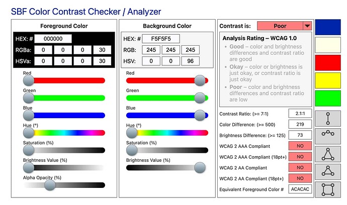
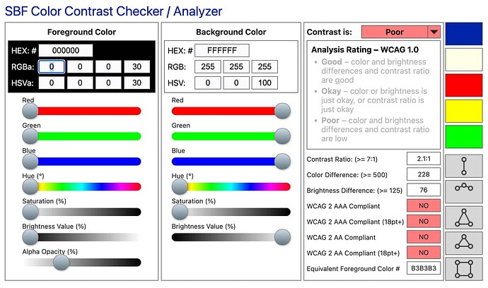
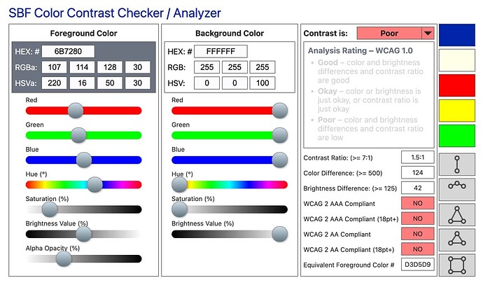
  • Foreground is black, but with 30% opacity
  • Background is dark-ish gray

Disabled fields with removed background:

Borders on disabled text fields:

(see disabled field above for an example)

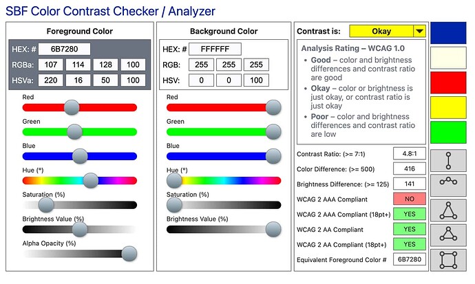
Note: it’s all opacity 30:

** Borders on regular text fields **

Barely okay

image

image

Edit: typo

13 Likes

It is very nice, but is not possible put it working on phonix 1.7,
The components not existis globally

Thank you so much @Antrater @margusp2rt and everyone involved into Moon Design System for Elixir.

More than just a design system, it has been a great way to learn on how to use Surface and build components into Live View.
It doesn’t matter if one components is not perfect or don’ fit your requirement, you can simply modify it as you wish
This is the beauty of Moon Design, it shows you different ways to use Surface and Phoenix

The repo and hex packages are constantly updated, yes sure it does use an older version of Phoenix and Surface, but once again you can learn from it and apply your findings to the latest versions if you really need the newest features

What makes it great, it is the full examples for each components, it includes the logic behind it. Check the Tables

use Phoenix.LiveView

alias Moon.Design.Table
alias Moon.Design.Table.Column
alias Moon.Components.Renderers.Datetime

def mount(_params, _session, socket) do
  {:ok, stream(socket, :models, models())}
end

defp models() do
  Enum.map(1..5, fn x ->
    %{
      id: x,
      name: "Name #{x}",
      created_at: DateTime.utc_now()
    }
  end)
end

...
    <Table items={model <- @streams.models} selected={nil} body_attrs={%{"phx-update" => "stream"}}>
...

Check also at a more complex components Dropdown. You will find many type of examples, using default slots, custom slots, custom trigger, attributes, even a date picker etc … It include the handle_events also

You can see a production project using Phoenix, Surface and Moon Design here

Once again thank you for the Moon Design Team for their work on this open source project

The latest version is working fine on the latest Phoenix version. However Live view, html and Live Dashboard need to be downgraded

      {:moon, "~> 2.81.0"},
      {:phoenix, "~> 1.7.11"},
      {:phoenix_html, "~> 3.0"},
      {:phoenix_live_view, "~> 0.18.3"},
      {:phoenix_live_dashboard, "~> 0.7.2"},

Using it on

elixir 1.16.1
erlang 26.2.2