
wyrdforge
Best practice for creating a dashboard chart for heat distribution in waste incinerators
Hi all,
in short, I am looking for best practices on visualizing (and maybe animating) specific data inside a phoenix app as a 3d chart.
Some background:
I am currently working on a prototype for a status and logbook portal for our waste incineration plant. This will aggregate metrics and logs from our OT systems and store them in Grafana Mimir and Loki via different interfaces (PromEx, AMQP, OpenTelemetry…)
The task I am currently chewing on:
Visualize imbalances in heat distribution inside the incineration boilers. This hints to the perfect time for a maintenance shutdown and scheduling of an explosive pressure wave cleaning (the process creates a really hard crust of salts and other remains) of the boiler internals.
Data structure:
The boiler data is built of positional temperature values in a 6X10x4 matrix and a 6x3x2 matrix for the funnel, that gathers lose salts. These values can be converted to RGB values by thresholds.
I already looked at chart.js and vega-lite, but the nearest thing would be a vega-lite geoshape, which I think is hard to set up for my case, or several heatmaps, that had to be skewed in order to resemble at least a bit of the boiler structure:
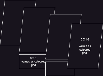
An additional task would be, to be able to switch through the last 90 days or so (which I think could be “easily” done with vega-lite controls.
Has anyone built something similar already and could hint me in the right direction, which approach and tooling would be the most efficient for the visualization? Or has anyone realized this with less effort in Grafana itself, so the charts could be embedded?
Best regards
Marcel
Most Liked

cmo
I think the important thing is finding the right charting library for the use case. There is certainly no shortage of them. Apache echarts is pretty feature-full and has 3d.
wyrdforge
Thank you all for your input 
After some research, I think, I will go the easy route first for the prototype and just present 4 or 5 side-by-side, animated heatmaps.
For the MVP I will either look deeper into echarts, which I didn´t know yet, because it looks really powerful and ssems to have just what we need (maybe we can map the data onto cylindral surfaces for every boiler) or try to realize something with vega to stay in a bit more known waters. Scanning the full documentation and finding the platformer game, gave me some inspiration for a potential solution.
cmo
I know how you feel. I work for industrial customers and recently my scope was “I just want I to look cool”  .
.
I recently built an animation of machine production cycles with liveview and echarts. It is so close to working as I would like it to but will try d3 to get full control, when I have a spare moment.
Popular in Questions








Other popular topics







 Latest Phoenix Threads
Latest on Elixir Forum
Sponsor Spotlight

Phoenix, LiveView, multimedia pipelines, distributed systems. 400 engineers, Elixir since 2017. Available for hire.
Categories:
Sub Categories:
Forums
Popular Tags
- #ecto
- #liveview
- #troubleshooting
- #learning-elixir
- #deployment
- #library
- #erlang
- #testing
- #genserver
- #mix
- #absinthe
- #remote-other
- #otp
- #plug
- #how-to-question
- #macros
- #postgres
- #channels
- #elixirconf
- #exunit
- #discussion
- #code-sync
- #javascript
- #podcasts
- #onsite
- #dialyzer
- #docker
- #authentication
- #umbrella
- #full-time-contract
- #podcasts-by-brainlid
- #ecto-query
- #elixir-ls
- #phoenix_html
- #iex
- #blog-post
- #graphql
- #genstage
- #ai
- #websockets
- #supervisor
- #advent-of-code
- #elixirconf-us
- #distillery
- #processes
- #forms
- #api
- #metaprogramming
- #security
- #performance
Our Sponsors

Build Elixir applications with speed and confidence.

Supporting innovation across the BEAM ecosystem.

We build reliable cloud platforms for business-critical systems.

Catch errors, track performance, monitor hosts and more.

Error tracking for Elixir devs who love to ship. Start your free account.

Producing high quality Elixir screencasts since 2017.

Enabling companies to succeed by building software people love.

The deployment platform built for Elixir: PaaS ease, VPS control.
The team behind Membrane, Popcorn, LiveDebugger. Available for hire.

Courses that'll move you from confusion to "Aha, now I get it!"