Hello, I need a modal to show an error to my user when it happens, then I use bootstrap modal.
<%= if @open_modal do %>
<!-- Modal -->
<div class="modal fade show" id="modal-live" data-bs-backdrop="static" tabindex="-1" aria-modal="true" role="dialog" style="display: block;">
<div class="modal-dialog modal-dialog-centered">
    <div class="modal-content">
    <div class="modal-header vazir rtl">
        <h5 class="modal-title" id="exampleModalLabel">Title</h5>
        <button type="button" class="btn-close" data-bs-dismiss="modal" aria-label="Close" phx-click="close_modal"></button>
    </div>
    <div class="modal-body vazir rtl">
        ERROR
    </div>
    <div class="modal-footer">
        <button type="button" class="btn btn-secondary" data-bs-dismiss="modal" phx-click="close_modal">Close</button>
    </div>
    </div>
</div>
</div>
<% end %>
please see the image:
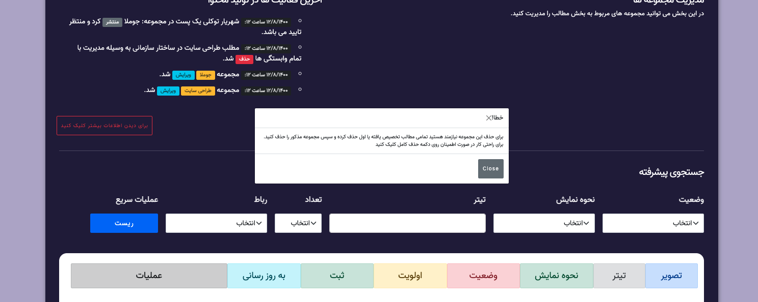
my code is run, but without change background color for focusing and has no fade or transition css animation
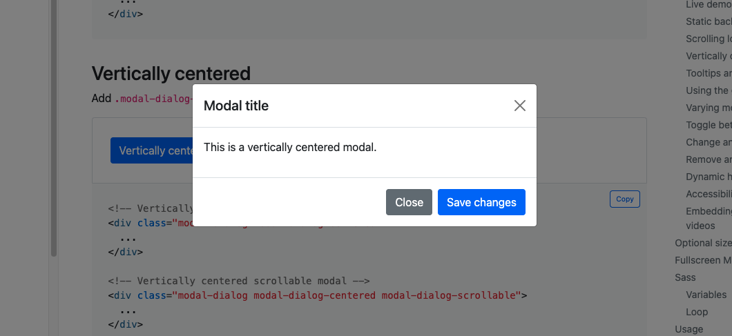
now see this without LiveView:
how to fix this, should I use phx-hook for this ?
Thanks


