This looks really cool - is this still being developed @mindok? I’m wondering whether to use it for my project (I just need a scatter plot with a fit line on top of it).
Hi @fabioticconi - it is still being maintained. I am using it myself regularly, and particularly using the primitives (e.g. Scale and Dataset to build custom visualisations).
Major improvements are a bit sporadic at the moment due to time commitments.
At the moment the only way I can think of to achieve the fit line would be to calculate the fit yourself and overlay a line plot on a point plot.
3 Likes
hey, thanks for the reply! Yes, the fit is no issue. Overlaying seems just what I need - although it would be nice to have “ribbons” for the confidence intervals.
You could generate a dataset with 3 series - one for the upper confidence, one for the best fit and one for the lower confidence and use a colour palette with a faded version of the main colour for the two confidence limit lines.
1 Like
Thank you for this great library, I would add candlestick charts to it, would this be possible or are there other libaries better to use in Elixir?
I’m not sure there are any financial charting libraries in Elixir. It would be pretty straightforward to add candle charts or other OHLC charts. Most of the layout logic is the same as vertical, stacked barcharts. Note, y-coordinates get flipped between Cartesian coordinates and graphics coordinates (eg SVG). I’m on my phone, but from memory the vertical barcharts code is quite explicit about handling this.
Looks similar project to Kino. Any reason to use this over the other?
I mean this project “Contex”
Contex is pure Elixir and doesn’t rely on Javascript. Kino charting with Vegalite renders charts with Javascript behind the scenes. If you want pure Elixir with a simple API, Contex meets that. However, Kino with Vegalite has many more visualisation options.
4 Likes
Hey mindok,
thanks for your great work!
I would also love an option to add markers to time series if you still plan implementing those ![]()
Any good hints from a pro where to get started if one would be interested in generating svgs?
Apologies for the slow reply @13ue - I’m not sure how I missed it! Markers is still on the list, just not with a timeline right now sorry!
For generating SVGs, the Mozilla documentation is pretty good in general (SVG: Scalable Vector Graphics | MDN)
I found the tutorials here: SVG Tutorials to be excellent as well, particularly if you want interactivity.
There’s a good article on coordinate system transformations here: Understanding SVG Coordinate Systems and Transformations (Part 2) — The transform Attribute – Sara Soueidan, inclusive design engineer - this is pretty fundamental to understand if you’ve never done computer graphics before.
1 Like
Hi all,
Version 0.5.0 of Contex has just been released. Details are in the changelog.
Highlights include:
- A nifty new auto-generated gallery in the documentation. Look out for module names containing
Gallery. Thanks to @l3nz for this. Whether you useContextor not, it’s worth taking a look at the code behind it if you want to jazz up your docs. Github user@travelmissive(sorry - can’t find you on Elixir Forums) provided a number of examples. - New
Contex.ContinuousLogScale, again thanks to @l3nz. This was a couple of options for handling negative numbers. - New legend positioning options
- A couple of various bug fixes, and fixes to tests & docs - thanks @axelson, gh user
@kianmeng, gh user@ruimfernanded - With a nudge from @axelson, I finally got around to figuring out how tagging works, so this version is the first tagged release

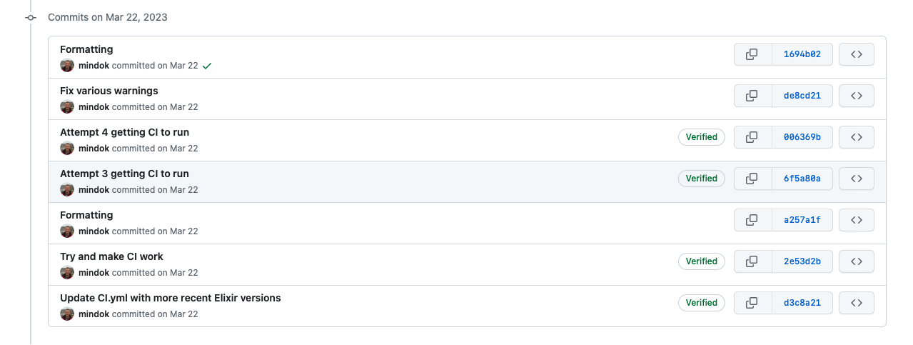
Also, CI works now. I thought I’d put this screenshot up as I know I’m not alone!!
12 Likes
@mindok, I would really like to use Contex to produce histograms as part of my Image library. Not sure if area charts, or more specific histograms, are on your roadmap but I thought I would ask here.
If not, I’m willing to try and implement it as a PR - I’ll just need your guidance from time-to-time.
Great library, thanks for making it!
PS: You can use image to do server side rendering of svg to an mage as well. just Image.from_svg(svg_string).
G’day @kip - I’ve been watching your image library with interest, and thanks for the tip on generating SVGs - I was fiddling around with resvg in Rust. Fonts and performance for large plots were giving me a fair bit of grief, so it was parked up, but I’ll take a look at your approach.
With histograms, I was originally looking at approaching it by having some kind of stats transformers to create the right summary Context.Datasets (e.g. cumulative stats for histograms, percentiles per data group for box plots, variograms) from an input Context.Dataset. But the data analysis space in Elixir has moved on since I started out. I’m thinking now that it may be better to define a protocol that the graphical side of Contex can consume in order to allow other data sources as inputs (e.g. Explorer). If you’re pre-calculating the colour counts from the images anyway I don’t think you will need to worry about this for now.
Anyway, that’s separate from the area chart question. I don’t have it on the roadmap as yet, but it would be most similar to a LinePlot from a layout algorithm PoV, but with a bit of data pre-processing to calculate the stacks, closure of the polylines and probably some better styling with gradient fills. I’d appreciate a PR if you’re happy to take it on. I’ll be on the road a bit the next week or so and may or may not have decent internet, but happy to provide input as needed when I can.
2 Likes
In one of the issues on github you mention bar charts not taking timeseries for input. If I were to fork this library to add candlestick charts, would this be a problem? Put otherwise, would I be able to take OHLC TimeSeries for input w/o some major changes of your existing code?
PS. Haven’t studied the code yet. Need to know first how feasible is this in your view.
Thanks
Hi @DaAnalyst - if you’re happy to put together a PR, I’m happy to review & merge. Adding a OHLC chart type shouldn’t be too hard. Most of the layout logic is already present in either the PointPlot chart type or BarChart. Option handling will be a bit different as you will likely need to nominate mapping of specific columns (i.e. date/time column, open, high, low & close price columns). Feel free to start a conversation within a GitHub issue (so it stays close to the code) if you want to expand on what tasks need to be done to implement this.
Would you be looking at different styles (e.g. candle vs tick, colouring based on open > close etc?).
If you get stuck, I may have a couple of hours available next week to do it.
1 Like
Hi @DaAnalyst,
So I made a fair bit of progress - I have some breaking tests I’ll fix up next week, but we’re pretty much there I think:

Edit: I’ll commit the code into a new OHLC branch (GitHub - mindok/contex at ohlc) so you can take a look.
Edit #2: If you generate the docs (mix docs) and browse to the gallery section you can see the example in the screenshot.
6 Likes
Great progress! I already have some ideas for improvement. Will create an issue on github after work and comment there.
Btw, the second chart there that you’re referring to as a tick chart is called bar chart (yeah, I know it could be mistaken with the other bar chart you support, but that’s its name).
A tick chart is a simple a line chart (a tick is just a price point in time).
1 Like
Any chance Radar charts (or Spider charts if you prefer) are on the roadmap?