I notice that Phoenix 1.7 uses TailwindCSS 3.2.4, and I notice that they build their components by first giving it some default classes, then you can pass in some additional classes if you want.
For example, you can see this button:
  attr :type, :string, default: nil
  attr :class, :string, default: nil
  attr :rest, :global, include: ~w(disabled form name value)

  slot :inner_block, required: true

  def button(assigns) do
    ~H"""
    <button
      type={@type}
      class={[
        "phx-submit-loading:opacity-75 rounded-lg bg-zinc-900 hover:bg-zinc-700 py-2 px-3",
        "text-sm font-semibold leading-6 text-white active:text-white/80",
        @class
      ]}
      {@rest}
    >
      <%= render_slot(@inner_block) %>
    </button>
    """
  end
Currently, using Tailwind <= 3.2.4, if you wanted the text in a button to be purple instead of white in one particulary instance of this button, you can simple pass it that class like so <.button class="text-purple-500">New User</.button> and it (almost always) applies the classes properly.
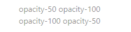
In the latest versions of TailwindCSS (from 3.2.5+) the generated css is always deterministic, so whatever the last class defined in the generated CSS file is, that class determines what displays. They say it’s always been wrong to write two conflicting class names on the same element because there’s really no telling how it might ultimately display.
So, I tried upgrading a barebones Phoenix project to Tailwind 3.2.7 then using the included button, and when I add text-purple-500, it no longer “takes”. I add an exclamation point, and it works, because all !classes show up last in the generated stylesheet.
The thing is, they say you want to avoid doubling up on class names of the same type wherever possible, and the “!” should technically be used for edge cases where the class can not be modified, like if it’s a component you don’t control.
So all that to say, what do you think the best way to modify say the core components button that you need multiple colors of but the exact same functionality otherwise? I was thinking of either just adding a get_button_variant_type like this,
attr :type, :string, default: nil
attr :class, :string, default: nil
attr :rest, :global, include: ~w(disabled form name value)
attr :variant, :string, default: "default"

def button(assigns) do
    ~H"""
    <button
      type={@type}
      class={[
        "phx-submit-loading:opacity-75 rounded-lg bg-zinc-900 hover:bg-zinc-700 py-2 px-3",
        @get_button_variant_type(@variant),
        @class
      ]}
      {@rest}
    >
      <%= render_slot(@inner_block) %>
    </button>
    """
  end

defp get_button_variant_type(variant) do
	 case variant do
      "default" -> "text-sm font-semibold leading-6 text-white active:text-white/80"
      "primary" -> "bg-white text-purple-500 active:text-purple-500/80"
      "clear" -> "bg-transparent border border-black-06"
    end
end
Or giving it a few functions like get_button_bg_color, get_text_color, etc.
There’s also the potential to run everything through something like a utility library like Twix similar to Tailwind Merge that eliminates class names of the same type just leaving the last class of each type, but it unfortunately doesn’t yet work with custom tailwind classes that you set up in your tailwind config file. It also seems like it would have the potential to slow things down if you’re doing this on almost every element on your page, but I don’t know that from experience.
 Or only define base classes and always pass the additional classes that you’d need.


