#ElixirFashionMLChallenge General Discussion/Questions

I’ve published a challenge to the Elixir community to collectively iterate until we have State of the Art (SOTA) accuracy on the FashionMNIST dataset. Along the Axon. FashionMNIST is a more difficult dataset than the MNIST dataset. However, it hasn’t been explored as heavily as other datasets. In December 2022, Jeremy Howard had a SOTA 5 epoch accuracy of 92.7%. While it might seem like a small data problem, by striving for SOTA, we’ll be learning techniques that can improve training for other larger image datasets. Additionally, some of those techniques are used in other domains like large language models.

I’ve created a Livebook notebook where I had 5 epoch 87.4% accuracy. https://github.com/meanderingstream/dl_foundations_in_elixir/blob/main/ElixirFashionML_Challenge/fashion_mnist_challenge.livemd. I’m encouraging the community to try to beat my result, improve upon other’s results, explore alternative modeling approaches, and publicly share their notebooks. I’ll create a forum entry to track the leaderboard results and another for results that didn’t beat the leaderboard. We can learn from what works and what didn’t work.

FashionMNIST is a great dataset because it is small and challenging. I ran my notebook on the CPU and didn’t use my GPU. So nearly all Elixir developers should be able to give this a try. Most everyone will need to learn something in order to make some improvements, so it should be a learning experience. The feedback from the community on what they did to improve upon the leaderboard will help everyone. Even sharing things that didn’t work can help others so I encourage you to share and everyone to be supportive of shared results.

Communication Channels:
The main channel will be the Elixirforum.com (Nx Forum). I intend to create several threads that should help communications.
Threads:
elixirfashionmlchallenge Leaderboard
elixirfashionmlchallenge Approaches that didn’t beat Leaderboard
elixirfashionmlchallenge General Discussion/Questions

Consider using the following tag when publishing on the Fediverse, elixirfashionmlchallenge

Finally, I’ll be attending ElixirConf 2023 in September and would love to have a “hallway discussion” with anyone that is participating in this challenge.

6 Likes

HINTS I’ll be adding hints on approaches over the next several days.

  • Randomize the data in a batch - Right now the data is pulled directly from the training dataset. That means the first batches just contain the first classification. The training process doesn’t see the first classification until it loops back through in the next epoch. They way I learned to train models, each epoch should randomly recalculate the batches. How much of an effect does randomizing the training set have? How much does randomizing each epoch have?

  • Batch size - How does batch size effect the accuracy? Are bigger or smaller batch sizes better? This hint may need to be re-addressed when we have some more tricks and techniques.

  • Data Augmentation - Augmentation is basically randomly modifying input data slightly while having the expectation that the model will still predict the right answer. Cocoa Xu’s opencv port to elixir has many tools to augment or change the original image, GitHub - cocoa-xu/evision: Evision: An OpenCV-Erlang/Elixir binding. However, when working with 24x24 pixels, those tools may not be really useful. Jeremy Howard implemented a cut and paste approach where one rectangle of the original image was replaced with something else. Consider taking two same-sized rectangles from the image and exchange them. Or maybe replacing them with black or maybe white or maybe grey. Or shift the image left/right up/down by a few pixels. The horses_or_humans notebook has a flip capability. Be careful because some of the classifications are symmetrical in one dimension. What about combining the above kinds of augmentation?

Adding these techniques to GitHub - elixir-nx/nx_image: Image processing in Nx would be really beneficial to the community. However, the randomness augmentation aspect should probably be outside of NxImage and eVision libraries.

great initiative!

fwiw, I got 87.7% accuracy just by running your livebook… suppose I got a lucky random seed…

so maybe fix the seed: 1 in the trainer or something so results are deterministic

This is pretty cool, I got myself to 93.3% accuracy with a simple approach. Excited to see what people do! I’ll share my solution in the leaderboard

EDIT: I accidentally evaluated against the train set :face_with_peeking_eye:. So my actual accuracy was much lower

2 Likes

HINTS In addition to creating the challenge in December, Jeremy was concurrently teaching a Fast.ai course From Deep Learning Foundations to Stable Diffusion. In the course, he was teaching the techniques that he used to achieve SOTA. So if we implement these techniques in Elixir, we should closely match the SOTA 12/15. In a previous note, I identified
three of the techniques. If we spread the effort across several participants, we can collectively build the techniques to get to SOTA 12/15. Try incrementally
focusing on one hint. When you complete the implementation you’ll very likely improve the leaderboard and add to your public successes.

If you don’t want to watch 18 hours of Fast.ai video on super-high-speed, there are a couple other resources that may be useful. The Fast.ai Github repository has written
lesson summaries along with the full text from the video, https://github.com/fastai/course22p2/tree/master/summaries. Also, Github can render Python notebooks in the browser so you can look at the Fast.ai notebook for the techniques and hints, https://github.com/fastai/course22p2/tree/master/summaries. Note that lesson numbers and notebook numbers don’t correlate.

So the previous hints were:
Randomize the data in a batch. 04_minibatch_training.ipynb is probably the notebook to look into.
Batch Size. Again 04_minibatch_training.ipynb. But it is really just changing the hyperparameter
Data Augmentation. 14_augment.ipynb

Hints Today’s hint won’t help you move up the leaderboard but it can help you, and others, understand what is happening in your model training. This hint is about visualizing what is happening with the model.

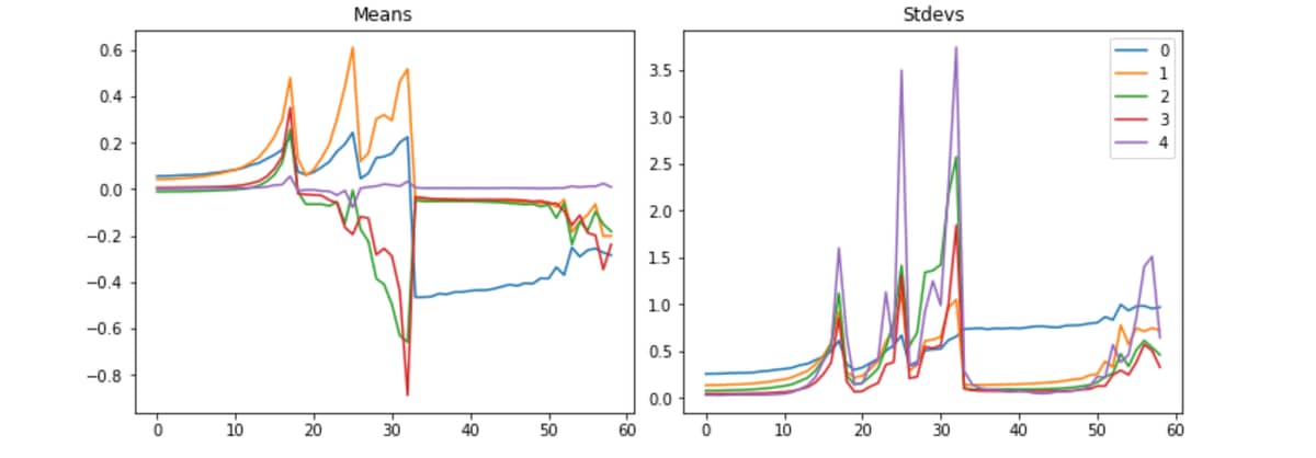
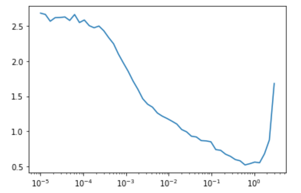
Let’s step back and talk about parameters, i.e. weights and biases. Parameters are the millions or billions of numbers that are optimized via calculations when training a model. An oversimplification of a model is a structured graph of matrix multiplications and additions in layers. Each graph node, layer, receives the output of one or more layers until the final output is reached. When there is a whole lot of multiplication and addition combining together it doesn’t take too long before the calculations exceed what can be represented by a computer as a number, i.e. NaN. So, researchers have generally focused on floating point numbers with full precision, f32, to represent the numbers in a model. Furthermore, they have identified that the optimal situation is when mean of the numbers is about 0.0 and the standard deviations is 1.0. Small floating point numbers are the general goal. By visualizing the mean and standard deviations of multiple layers we can see when the model crashes and starts to recover. Consider creating a Livebook visualization of parameters or as Jeremy calls them activations.

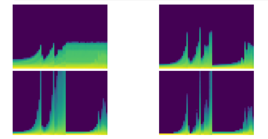
Fast.ai also has a histogram of activations (parameters). Here are a couple of pictures of the crashing training from above and a later well controlled training.


Using the words from the summary, here is how Jeremy described the histogram algorithm.

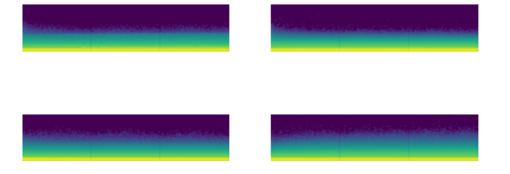
We call them the colorful dimension, which they’re histograms…So a histogram, to remind you, is something that takes a collection of numbers and tells you how frequent each group of numbers are. And we’re going to create 50 bins for our histogram. So we will use our hooks that we just created, and we’re going to use this new version of append_stats. So it’s going to train as before, but now we’re going to, in addition, have this extra thing in stats, which is going to contain a histogram. And so with that, we’re now going to create this amazing plot. Now what this plot is showing is for the first, second, third, and fourth layers, what does the training look like? And you can immediately see the basic idea is that we’re seeing the same pattern. But what is this pattern showing? What exactly is going on in these pictures? So I think it might be best if we try and draw a picture of this. So let’s take a normal histogram. So let’s take a normal histogram where we basically have grouped all the data into bins, and then we have counts of how much is in each bin. So for example, this will be like the value of the activations, and it might be, say, from 0 to 10, and then from 10 to 20, and from 20 to 30. And these are generally equally spaced bins. Okay. And then here is the count. So that’s the number of items with that range of values. So this is called a histogram. Okay. So what Stefano and I did was we actually turned that histogram, that whole histogram, into a single column of pixels. So if I take one column of pixels, that’s actually one histogram. And the way we do it is we take these numbers. So let’s say it’s like 14, that one’s like 2, 7, 9, 11, 3, 2, 4, 2. And so then what we do is we turn it into a single column. And so in this case we’ve got 1, 2, 3, 4, 5, 6, 7, 8, 9 groups, right? So we would create our 9 groups. Sorry, they were meant to be evenly spaced, but they were not a very good job. Got our 9 groups. And so we take the first group, it’s 14. And what we do is we color it with a gradient and a color according to how big that number is. So 14 is a real big number. So depending on what gradient we use, maybe red’s really, really big. And the next one’s really small, which might be like green. And then the next one’s quite big in the middle, which is like blue. Next one’s getting quite, quite bigger still. So maybe it’s just a little bit, sorry, should go back to red. Go back to more red. Next one’s bigger stills, it’s even more red and so forth. So basically we’re taking the histogram and taking it into a color coded single column plot, if that makes sense. And so what that means is that at the very, so let’s take layer number two here. Layer number two, we can take the very first column. And so in the color scheme that actually Matplotlib’s picked here, yellow is the most common and then light green is less common. And then light blue is less common and then dark blue is 0. So you can see the vast majority is 0 and there’s a few with slightly bigger numbers, which is exactly the same that we saw for index one layer. Here it is, right? The average is pretty close to 0. The standard deviation is pretty small. This is giving us more information, however. So as we train at this point here, there is quite a few activations that are a lot larger, as you can see. And still the vast majority of them are very small. There’s a few big ones, they’ve still got a bright yellow bar at the bottom. The other thing to notice here is what’s happened is we’ve taken those stats, those histograms, we’ve stacked them all up into a single tensor, and then we’ve taken their log. Now log1p is just log of the number plus one. That’s because we’ve got zeros here. And so just taking the log is going to kind of let us see the full range more clearly. So that’s what the log’s for. So basically what we’d really ideally like to see here is that this whole thing should be a kind of more like a rectangle. The maximum should be not changing very much. There shouldn’t be a thick yellow bar at the bottom, but instead it should be a nice even gradient matching a normal distribution. Each single column of pixels wants to be kind of like a normal distribution, so gradually decreasing the number of activations. That’s what we’re aiming for. There’s another really important and actually easier to read version of this, which is what if we just took those first two bottom pixels, so the least common 5%, and counted up how many were in, sorry, the least common 5%. The least common, not least common either, let’s try again. In the bottom two pixels, we’ve got the smallest two equally sized groups of activations. We don’t want there to be too many of them because those are basically dead or nearly dead activations. They’re much, much, much smaller than the big ones. And so taking the ratio between those bottom two groups and the total basically tells us what percentage have zero or near zero or extremely small magnitudes. And remember that these are with absolute values. So if we plot those, you can see how bad this is. And in particular, for example, at the final layer, nearly from the very start, really, nearly all of the activations are just about entirely disabled. So this is bad news. And if you’ve got a model where most of your model is close to 0, then most of your model is doing no work. And so it’s really not working. So it may look like at the very end, things were improving. But as you can see from this chart, that’s not true. The vast majority are still inactive. Generally speaking, I found that if early in training you see this rising crash, rising crash at all, you should stop and restart training because your model will probably never recover. Too many of the activations have gone off the rails. So we want it to look kind of like this the whole time, but with less of this very thick yellow bar, which is showing us most are inactive.
[lession16.txt]

Notebooks 10_activations.ipynb, 11_initializing.ipynb, 12_accel_sgd.ipynb

Having either the polyline or the histogram would help visualize Axon models. Rohan Relan provided a notebook that uses a publish/subsribe example for getting information out of the training loop and into a Kino visualization. Axon model hooks, Model hooks — Axon v0.6.0, provide a technique for getting activations from layers that can be published to Kino.

1 Like

Hints There was a paper called something like: All You Need is An Initializer. In the paper, they proposed that a special initializer would allow the controlled training of a model.

The paper was about a specific model and a special initializer, however, the reality is the special initializer didn’t scale to the various model architectures. In 2018, the One Cycle paper came out. One of the key aspects of the paper is starting with a significantly lower learning rate and then ramping up the learning rate. This phase is followed by a reduction in the learning rate, i.e. finishing the one-cycle. This was an important factor in the Fast.ai team’s performance in the DawnBench competition. The lower learning rate allows the randomly generated weights to adjust to more stable values. Scaling to a higher learning rate helps the model train faster. The final down ramping of the learning rate helps prevent overshooting any optimal values. There are lots of web tutorials pages for one cycle. One key aspect is that when the learning rate increases there is a corresponding decrease in momentum. This topic is covered in Lesson 16 and 12_accel_sgd.ipynb

With the One Cycle schedule, how do we know what to pick as the maximum learning rate? The Learning Rate finder tool helps by graphically representing the loss value over an increasing learning rate schedule. You then pick a value that is on the downward slope, near but not at the absolute bottom.

LR_Finder

1 Like

Hints The preceding hints have been general purpose and useful to any image focused model or any model that has some randomly initiated weights. This hint is really specific to the FashionMNIST problem domain or maybe grey scale 24x24 images. Try a custom ResNet model like the model in 13_resnet.ipynb. Add some dropout or dropout 2d. Batch normalization should probably be used. Lesson 18 and 19 cover the model. Try some small Bumblebee models but be sure to randomly initialize the weights. Pre-trained weights are out of scope for the competition.

1 Like

Hints The last hint I have is fairly limited in use. It works for competitions and it can work for situations where accuracy is emphasized and the GPU can handle extra processing. For a single image, Test Time Augmentation results in several images that are all processed at inference. The multiple copies of the original image are augmented with different techniques, like we used in training, but here multiple outputs are combined to improve the accuracy of the interence prediction. The details are in Lesson 19 and notebook 14_augment.ipynb

1 Like