Quartz (previously Playfair) - Data Visualization Library (aimed at publication, not interactive display)

Playfair (named after: William Playfair) is a data visualization/plotting library with the goal of being able to produce publication-quality figures without the use of any other tools. Because producion publication-quality figures always entails some manual adjustments, Playfair aims to be very customizable. When picking between convenience/terseness or customizability, Playfair will often choose customizability. Playfair doesn’t draw anything directly. Instead, it uses the typst typesetting system as a backend, through the interface provided by ExTypst.

Currently it only supports boxplots (and the boxplots don’t even show the outliers outside the whiskers because I haven’t implemented that part yet). I’ve decided to implement boxplots before more basic plots such as scatter plots becuase boxplots are actually quite complex.

The library is under very active development and APIs might changes without warning. Don’t use this for anything serious yet.
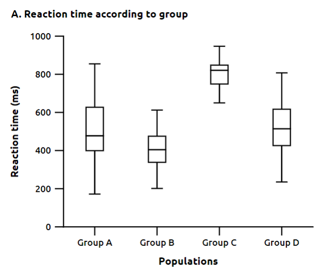
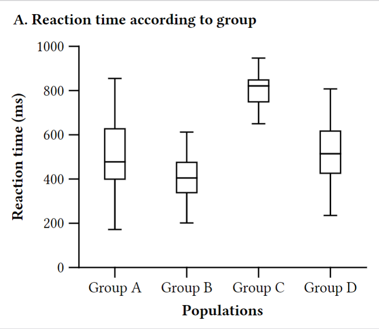
Some example code:

XYPlot.new()
# Data is generated somehwere else in the code
|> BoxPlot.plot("x", "y", data())
|> XYPlot.put_title(Typst.raw("strong()[A. Reaction time according to group]"))
|> XYPlot.put_axis_label("y", Typst.raw("strong()[Reaction time (ms)]"))
|> XYPlot.put_axis_label("x", Typst.raw("strong()[Populations]"))
# Drop the spines for the X2 and Y2 axes (you can also remove those axes instead)
|> XYPlot.drop_axes_spines(["x2", "y2"])
|> XYPlot.render_to_pdf_file!("examples/box-plot-example-without-spines.pdf")

Generated figure (converted from PDF to PNG because ExTypst can’t generate PNG or SVGs directly, althougn I believe typst itself can):

The code is inspired by Python’t Matplotlib but with a more functional style. The goal is to provide all the plot types and general functionality provivded by matplotlib except for the interactive parts. I’m open to support animatinos by generating multiple frames and then gluing them together, but it’s definitely not a priority.

Issues (so far!)

Unlike Matplotlib, it’s not yet possible to have more than one plot in the same figure (Playfair doesn’t even have the notion of a figure), but that’s actually quite simple to implement using typst as a backend (we can just reuse the native typst layouts to compose plots together).

The main issue with Playfair right now is that it isn’t easy to draw arbitrary content in the labels area, for example (you might want that if you’re doing some survival analysis with Kaplan-Meier curves and want to draw a table with the “at risk” counts below the x-axis ticks). In all fairness, this is something with which even Matplotlib strugles a lot. Most of the interesting functionality requires some kind of constraint solver (even a linear solver employing something like the simplex method would probably be enough for most cases), and it’s hard to provide an interface which makes it natural to draw something AND which is compatible with the way constraint solvers like to work.

Another problem with trying solve constraints intelligently is that we actually need the backend (i.e. typst) to evaluate the object sizes (the Elixir part has no idea how text is rendered, or even worse, how mathematical formulas are rendered!), and this means that a lot of the constraint solving must happen inside typst, instead of calling an optimized constraint solver.

10 Likes

Some questions (especially for @viniciusmuller, but anyone else feel free to answer):

  1. Is it possible to have ExTypst generate something other than PDFs, namely SVG and PNG? SVG and PNG are useful either to deal with publishers who don’t want PDFs submitted as images, or to embed such images places like word documents

  2. Currently, typsts isn’t thaaaat slow to compile, and to my great surprise I managed to install a rust toolchain quite quickly. However, it can still be a stumbling block for some. Would it be possible to use rust_precompiled to make the installation process even easier?

  3. Would there be any way of querying typst for sizes of some of the content? I’m thinking in particular of text and math formulas, but I guess what I want is the ability to query the sizes of arbitrary boxes. This could be useful in order to have some interplay between the Elixir frontend (which decides things such as how many ticks there are in an axis) and Typst (which renders the tick labels, and as such can determine whether labels overlap or not); in case the labels do overlap, it would be interesting to have a way of feeding that information to Elixir so that Elixir could pick a smaller number of ticks. I’m not asking for bidirectional communication between typst and Elixir, but would it be possible for Elixir to query the sizes of at least some of the generated boxes so that it would know the optimal number of ticks?

There should be a way to configure plots in order to decide on things such as line width, default font size, etc. Although all of this can be passed manually into functions, or using raw typst script, I think it would be easier if there was a way of saying stuff like “axis labels should be 9pt and bold”. Matplotlib (which is my main inspiration), already provides a way of doing this using a “global” configure, which can be set in the current context. The idiom for doing that in Python is:

with matplotlib.rc_context({key: value, another_key: another_value, ...})
    # code that plots stuff using this style

# the style defined above is no longer valid here

The most direct correspondence to this is to use the process dictionary to define the “global config” in a way that it doesn’t need to be passed down into each function. This could be encapsulated in a function, so we could actually have something like this:

Playfair.with_config(%{my: "new", config: "here"}, fn ->
  # Code that plots things and takes the config from the process dictionary
end)

The main issue with using the process dictionary for configuration is that it stops working if we start spawning processes to draw our stuff. I don’t think this will be very common, though… Although data analysis can be parallelized (and often is!), data vizualization is often very “serial” (and not parallel) in nature. I wonder what more experienced people think about this. The Elixir formatter, for example, uses (used to use? I haven’t looked at the source for some time) the process dictionary to store some configuration options to avoid having to pass them around through all the functions.

Update

I’ve simplified the user-facing UI. Now the user can add add the plot title using simple strings (i.e. there’s now no need to build special “typst content” structures to add text elements, although that remains an option for more advanced use cases). The plotting module (YXPlot) now contains a number of configuration options, which can be set for a given plot by wrapping the plot in the right function call:

# The Playfair.Plot2D.XYPlot module contains pretty much everything
    # related to 2D plots with cartesian coordinates in which the X and Y axes
    # are perpendicular
    alias Playfair.Plot2D.XYPlot
    # Import a special sigil to allow us to write length units in a natural way
    import Playfair.Length, only: [sigil_L: 2]
    alias Playfair.Config

    # Ensure deterministic data
    :rand.seed(:exsplus, {0, 42, 0})
    # norm/2 is a function that returns a random value following
    # a Normal(mu, sigma) distribution
    reaction_times = [
      {"Group A", Enum.map(1..50, fn _ -> norm(500.0, 170.00) end)},
      {"Group B", Enum.map(1..60, fn _ -> norm(400.0, 100.0) end)},
      {"Group C", Enum.map(1..30, fn _ -> norm(790.0, 60.0) end)},
      {"Group D", Enum.map(1..80, fn _ -> norm(500.0, 150.0) end)},
    ]

    options = %{
      # The Ubuntu font ships by default with ExTypst
      text_font: "Ubuntu",
      # By setting the text size, we automatically set the size
      # for most text elements in the plot
      # (i.e. titles, axis labels, tick labels, etc)
      # NOTE: this uses a special sigil that allows us to define
      # lengths that mix different units in a way that's correctly
      # interpreted by the Typst backend.
      text_size: ~L[9pt],
      # We can set the label size specifically, and it will
      # override the `text_size` attribute
      major_tick_label_size: ~L[8pt],
      # By default the text weight is medium...
      text_weight: "medium",
      # But we can overwrite it for default plot elements
      plot_title_weight: "bold",
      axis_label_weight: "bold"
    }

    # Note that we don't need to build special structures to hold our text.
    # We can use normal strings, and Playfair will take care of applying
    # the default styles. By default, strings are escaped, but that
    # can be overriden too
    Config.with_options(options, fn ->
      XYPlot.new()
      |> XYPlot.boxplot("x", "y", reaction_times)
      |> XYPlot.put_title("A. Reaction time according to group")
      |> XYPlot.put_axis_label("y", "Reaction time (ms)")
      |> XYPlot.put_axis_label("x", "Populations")
      # Drop the lines of the "x2" (top) and "y2" (right) axes.
      # These axes are added by default to the XYPlot, but actually
      # any number of axes can be added in any location.
      |> XYPlot.drop_axes_spines(["x2", "y2"])
      |> XYPlot.render_to_pdf_file!("examples/box-plot-example-without-spines.pdf")
    end)

The result is the following figure:

image

I find that Elixir is missing some SVG-handling generic tools, and using Typst is a really interesting technical approach. I’m wondering though, if we are going to bring in an external tool / language, whether this has any advantage over porting out to MatPlotLib / seaborn, or bringing in VegaLite or ECharts? After all, plotting libraries costs years of heartbeats to build.

This is not the problem. Handling SVG is realy easy, actually. You can write an SVG-writing library in an afternoon, and start drawing complex stuff the next day. The problem is always text and font handling. You need a way to measure the dimensions of text boxes or math formulas. Properly typesetting (and measuring) text with modern fonts is a major undertaking. And do draw anything non-trivial you need access to the metrics of your text boxes. That is something which is very easy to do in typst (although I don’t know of a way of feeding those measurements back into Elixir). Handling text and math formulas is the real bottleneck, and that’s what Typst brings in.

It does have some advantages, yes.

  1. Advantages over matplotlib: the handling of formulas in mathplotlib is really not that great. Matplotlib attempts to port the TeX math layout algorithm to Python, with very mixed success. Also, there are some design decisions in Matplotlib with which I disagree (I can detail on that a bit more), anc which in my opinion add a lot of complexity for very little gain (for example, the way matplotlib handles orthogonal axes and the way it handles legends). Text handling in matplotlib is very limit, as one can’t use different font styles in the same text block, unless we have TeX render our text elements (which requires installing TeX, which is a can of worms on its own). Eventually, I got quite experienced in drawing custom stuff on top of matplotlib, and I noticed that the part that takes “years of hardbeats” to build is text handling (which Typst already does for me, and Typst depends on some Rust crates which I believe did take multiple years to build) and parts which I’m not interested in at all, namely all the interactive stuff, which is a distraction for my goals of generating the best static output. The rest is mostly heuristics (with some actual constraint solving) for element positioning, which don’t actyually work that well and which I have to noverride all the time. Also, matplotlib is not trivial to install and requires a working python environment, and python environments are not very easy to set up. The good thing about Typst is that it’s just a “big NIF”, and if we can get it to work with RustPrecompiled, there won’t even be a compilation step

  2. Advantages over VegaLite: VegaLite requires a browser-like engine to render the charts into something static for publication purposes. I don’t belive you can do it with NodeJS alone, for example. And even if I can, setting up a NodeJS environment is not that easy. Finally, from my preliminary exploration, VegaLite is not great if you want to draw custom stuff on your plots. I’m the first to admit that as it is now, Playfair can’t draw any custom stuff on the plots, but I can see pretty clearly the steps I’d have to take to draw it.

  3. Advantages over ECharts: ECharts seems to have all the sabe advantages and disadvantages of VegaLite.

2 Likes

Handling text and math formulas is the real bottleneck, and that’s what Typst brings in.

Agreed. It’s incredible how difficult simulating word-wrap can be in SVG. But when I say missing generic SVG handling, I mean full specs and not a subset like ChunkySVG; and it should be able to round-trip parse from XML and write. I don’t know how one would do that in Elixir.

matplotlib is not trivial to install and requires a working python environment, and python environments are not very easy to set up.

Again agreed with gusto. I’ve been doing LaTeX with and without Python for a long time, and they really have some problems.


Inspired by your post, I’m looking at how to:

  1. get publication quality static SVG
  2. with accurately placed math
  3. “without other tools”

ECharts has SSR but probably isn’t a winner since AFAIK its renderer doesn’t handle latex-like maths.

What do you think about pgfplot, perhaps in conjunction by type-setting with Tectonic? 1,2 comes from its LaTeX heritage, and 3 seems to be a similar Rust/cargo affair as bringing in Typst.

That’s my whole point. SVG is not the problem, the problem is correct text handling. That’s inherent to the complexity of human languages and typographical rules. You need an actual text-rendering engine for that, and Typst is such a rendering engine (and a very small one at that in terms of binary size and memory use).

Parsing the XML you’ve just written isn’t actually helpful for this. You actually need to query an SVG renderer to get the proper line break locations.

Tectonic seems to be strictly more complex than Typst, although it does keep compatibility with latex, so that would be a plus, I guess?

Hey there! Thanks for the interest in Typst, I see you’re building something really nice with it!

Is it possible to have ExTypst generate something other than PDFs, namely SVG and PNG?

Currently upstream typst does not appear to provide provide SVG output, as there’s an open issue for it. About PNG, it seems that typst supports PNG output and when I get some time I’ll give it a try, but in the mean time if you’re feeling adventurous, a PR would also be welcome!

Would it be possible to use rust_precompiled to make the installation process even easier?

That would be nice, when writing the bindings I didn’t try to add precompiled NIFs because I’m not familiar with them and mostly because I didn’t know if there would be interest from the community in typst. I’ll see how precompiled NIFs work and about adding support for them.

Would there be any way of querying typst for sizes of some of the content?

I think in this case, this is something that needs to be done on the typst side, since we just format a typst document and give it to the typst formatter, which already outputs a PDF binary.
Also, most of their API in rust is private, so that means external code using it cannot access a lot of properties/methods.

Is there a way of storing custom metadata in a PDF file using Typst? One could write a Typst program which would generate objects and store their metrics in PDF metadata. Then, one could parse that metadata out of the PDF using Elixir and get access to it

It seems that you can use the document function to set metadata, but it appears to be only limited to author and title. But if you can serialize/deserialize what you need in string format, I think this approach could work

Yes, I could encone arbitrary data in the title and then somehow extract the data from the PDF. That seems interesting.

It turns out it’s easy to “leak data” from Typst by raising an error on purpose and parsing the error message. With that, it’s trivial to get the dimensions of text nodes (or anything else you need)

1 Like

In case someone wants to be able to query element dimensions from Typst, I’m doing something like this:

defmodule Playfair.Typst.Measuring do
  alias Playfair.Typst.TypstAst
  alias Playfair.Typst.Serializer
  alias Playfair.Length

  def measure(elements) do
    items = Enum.map(elements, fn element -> {element.id, element} end)
    dictionary = TypstAst.dictionary(items)
    serialized_dictionary = Serializer.serialize(dictionary)

    # Insert the serialized plot into a template
    typst_file = """
    #let elements = #{serialized_dictionary}

    #style(styles => {
      let sizes = ();
      for (id, element) in elements {
        let size = measure(element, styles)
        let line = (
          id,
          ":",
          repr(size.width),
          ":",
          repr(size.height)
        ).join()

        sizes.push(line)
      }

      assert(0 == 1, message: sizes.join("\\n"))

      [Unreachable]
    })
    """

    # Try to render the typst code into PDF
    # Typst will return an error
    {:error, output} = ExTypst.render_to_pdf(typst_file)
    [_ignore, data] = String.split(output, "assertion failed: ")

    sizes =
      data
      |> String.split("\n")
      |> Enum.map(fn line ->
          [id, width, height] = String.split(line, ":")
          {id, {parse_length(width), parse_length(height)}}
        end)
      |> Enum.into(%{})

    Enum.map(elements, fn element ->
      {width, height} = Map.fetch!(sizes, element.id)
      %{element | width: width, height: height}
    end)
  end

  defp parse_length(text) do
    {float, ""} =
      text
      |> String.trim("pt")
      |> Float.parse()

    Length.pt(float)
  end
end

New version: GitHub - tmbb/quartz: Plotting for Elixir using Typst

I’ve scraped pretty much the entire project and started over. The project is now called Quartz becuase it’s similar to the vaporware (?) Basalt python library described here. I thought that quartz is a nice name because it haZ all da Qool LetterZ and also because I initially tried to make it plotting-agnostic and something one could use just to draw figures. It turns out that supporting non-trivial plots actually required the whole thing to be plot-oriented, but now it’s too inconvenient to change the name.

The basic idea is that Quartz converts your instructions on how to draw a plot into linear progamming constraints, which it then solves using my Dantzig library (very unstable, and only supports Linux at the moment). Dantzig uses an open source linear programming solver which is bundled as a binary in the source.

Unfortunately, once part of your program is based on constraint solving, then all your program must be based on constraint solving, which means that there is no compatibility between Quartz and Playfair. I believe that constraint solving is probably more extensible and even composable, but it’s definitely a bit harder to implement than the naïve version.

One of the good parts is that although I still use typst as a rendering engine, I now perform all layout calculations in Elixir based on the text dimensions returned by Typst (determining text layout is impossible in Elixir, but actually very easy in Typst). You’re not meant to be able to query typst for object dimensions, but it’s very easy to do by intentionally raising an exception inside typst and then parse the error logs. The fact that just before generating the typst code you have access to all object dimensions might be useful in the futuren for some “post processing” just before sending the output to typst.

Because it was so hard to reimplement everything in constraint solving, I can’t actually show a full plot yet, but I can show the outside decoratios of a plot (the actual data would go into the central square delimited by the solid lines. The dotted lines are the boundaries of the canvases into which Quartz divides the image.

A very preliminary example of two plots side by side, with proportions specificed by the user:

The source code thath generates the figure above:

  def example() do
    use Dantzig.Polynomial.Operators
    alias Quartz.Figure
    alias Quartz.Plot2D
    alias Quartz.Length

    figure =
      Figure.new([width: Length.cm(16), height: Length.cm(6)], fn fig ->
        figure_width = fig.width

        _plot_task_A =
          Plot2D.new(id: "plot_task_A", left: 0.0, right: 0.55 * figure_width)
          # Use typst to explicitly style the title and labels ――――――――――――――――――――――――――――――――
          |> Plot2D.put_title("A. Task A")
          |> Plot2D.put_axis_label("y", "Y-label")
          |> Plot2D.put_axis_label("x2", "X2-label")
          |> Plot2D.put_axis_label("x", "X-label without $math$")
          |> Plot2D.finalize()

        _plot_task_B =
          Plot2D.new(id: "plot_task_B", left: 0.55 * figure_width + Length.pt(8), right: figure_width)
          # Use typst to explicitly style the title and labels ――――――――――――――――――――――――――――――――
          |> Plot2D.put_title("B. Task B")
          |> Plot2D.put_axis_label("y", "Y-label")
          |> Plot2D.put_axis_label("x2", "X2-label")
          |> Plot2D.put_axis_label("x", "X-label (with  math: $x^2 + y^2$)", text: [escape: false])
          |> Plot2D.finalize()
      end)

    Figure.render_to_pdf!(figure, "example.pdf")
  end

Unlike Playfair, in which almost everything is pure and referentially transparent, with very little use of the process dictionary, Quartz is an imperative monster which invisibly builds a linear program behind your back inside the process dictionary. It does try to hide this fact very well. As a user, you never need to know that anything is happening inside the process dictionary. It does make it very hard to generate plots in parallel, though (but it’s definitely something I could address in the future).

Plans for the future

The fact that Quartz has access to a linear programming solver means I can have more advanced layouts almost for free, and it makes it very easy to deal with variables whose value is substitued later (it’s basically lazy evaluation implemented on top of a linear programming solver). The main problem is that Quartz may raise an error if you tell it to draw something impossible. Supposedly, this can only be triggered by the user if the user tries to draw a figure which is too small for the fixed-size elements it contains.

For those who might be interested, Quartz now supports multiple axes per location (bottom, top, right or left). It just draws the axes (which are simply a line with a label, I can’t yet add any data or even axis ticks). You can see an example with some “cursed” units.

The code that generates that plot is very similar to the code above, it just adds some extra drawings to the plot:

    figure =
      Figure.new([width: Length.cm(16), height: Length.cm(6), debug: false], fn fig ->
        figure_width = fig.width

        _plot_task_A =
          Plot2D.new(id: "plot_task_A", left: 0.0, right: 0.55 * figure_width)
          |> Plot2D.add_bottom_axis("x3")
          |> Plot2D.add_bottom_axis("x4")
          # Use typst to explicitly style the title and labels ――――――――――――――――――――――――――――――――
          |> Plot2D.put_title("A. Task A")
          |> Plot2D.put_axis_label("y", "Y-label")
          |> Plot2D.put_axis_label("x", "X.A axis label (mg/m#super([-2]))", text: [escape: false])
          |> Plot2D.put_axis_label("x3", "X.B axis label (Kg$dot$s#super([-2/3]))", text: [escape: false])
          |> Plot2D.put_axis_label("x4", "X.C axis label (mmol$dot$kg#super([-5/7]))", text: [escape: false])
          |> Plot2D.put_axis_label("x2", "X2-label")
          |> Plot2D.finalize()

        _plot_task_B =
          Plot2D.new(id: "plot_task_B", left: 0.55 * figure_width + Length.pt(8), right: figure_width)
          # Use typst to explicitly style the title and labels ――――――――――――――――――――――――――――――――
          |> Plot2D.put_title("B. Task B")
          |> Plot2D.put_axis_label("y", "Y-label")
          |> Plot2D.put_axis_label("y2", "Y2-label")
          |> Plot2D.put_axis_label("x2", "X2-label")
          |> Plot2D.put_axis_label("x", "X-label (with  math: $x^2 + y^2$)", text: [escape: false])
          |> Plot2D.finalize()
      end)

    path = Path.join([__DIR__, "side_by_side_plots", "example.pdf"])
    Figure.render_to_pdf_file!(figure, path)

Again, I’m very happy with this because the main challenge in data visualization libraries is often not displaying the data (which is just a set of simple shapes put in the correct position) but also the “boring” parts such as axis labels, plot titles and all those things which are essential in order to have a publisheable plot.

The labels for the vertical axes should be rotated, but I don’t support rotated text yet

1 Like

Ok, some reality check: the the approach I took is mathematically very elegant. Pretty much every measurement in the figure is represented by a (sometimes) multivariate polynomial, which is implemented symbolically with what I think is a pretty clever canonical representation.

Each polynomial is a struct containing a map from products of variables to coefficients. For example, ab + 7cd + 9 is represented by %{["a", "b"] => 1, ["c","d"] => 7, [] => 9}. I then implemented symbolic operations such as addition, multiplication and variable substitution on top of this representation. While building the figure, I generate constraints between degree one polynomials and feed them into the linear solver in order to get numerical values. Then, I substitute the variable values in the polynomials and turn all dimensions into nice floating point numbers.

One of the best parts of this is that I can get the text dimensions all at once from Typst, instead of querying it every time I want to render a text element.

All of this (predictably) takes a huge amount of memory when drawing lots of objects if the and size of every element is kept as as an independent polynomial. Maybe I should create some new object types like point clouds which store the dimensions of the full cloud as polynomials and the and the dimensions of the points as floating points between 0 and 1 relator to the dimensions of the cloud.

The basic design is quite robust and can handle these optimisations. The only problem is that because I don’t have much control over the constraint solving process, some figures might be impossible to draw and raise an error, especially if the figure size is too small. Maybe I should tag the constraints with different levels of priority and relax them if the first attempt fails.

1 Like

Quartz (this library is no longer called playfair) can now draw line plots (by very inefficiently drawing line segments individually instead of using a normal path because I haven’t iomplemented paths yet).

Example here:

image

Code:

defmodule Quartz.Benchmarks.LinePlot do
  use Dantzig.Polynomial.Operators
  require Quartz.Figure, as: Figure
  alias Quartz.Plot2D
  alias Quartz.Length

  def build_plot() do
    figure =
      Figure.new([width: Length.cm(8), height: Length.cm(6), debug: false], fn _fig ->
        [[bounds]] =
          Figure.bounds_for_plots_in_grid(
            nr_of_rows: 1,
            nr_of_columns: 1,
            padding: Length.pt(16)
          )

      x = for i <- 1..100, do: 0.01 * i
      y = for x_i <- x, do: x_i * 0.3 + (0.05 * :rand.uniform())

      data = %{x: x, y: y}

      _plot =
        Plot2D.new(id: "plot_A")
        |> Plot2D.set_bounds(bounds)
        |> Plot2D.line_plot("x", "y", data)
        # Use typst to explicitly style the title and labels ――――――――――――――――――――――――――――――――
        |> Plot2D.put_title("A. Line plot")
        |> Plot2D.put_axis_label("y", "Prediction: $f(x)$", text: [escape: false])
        |> Plot2D.put_axis_label("x", "Predictor: $x$", text: [escape: false])
        |> Plot2D.finalize()
      end)

    path = Path.join([__DIR__, "line_plot", "example.pdf"])
    Figure.render_to_pdf_file!(figure, path)
  end
end
3 Likes

I have changes the API by making axes implicit (usually one wants to plot on the x and y axis, and specifying that everytime gets boring).

I show an example (which actually contains no new functionality) of plotting the KDE of the posterior probability distribution for a parameter in a simple Bayesian model. The model was fit using Stan, with bibndings provided by my Ulam package. Below, I show the code, which is quite involved, because I build the KDE “outside” of quartz. I will move this functionality inside Quartz so that one can simply write Plot2D.plot_kde(series) and quartz will handle the details (usually there isn’t much you want to do with a KDE except plotting it or using linear interpolation to learn a couple things about it). This plot showcases the use of line plots (line plots become quite smooth if you choose fine subdivisions) and the use of color to distinguish between the montecarlo chains.

This visualization is inspired by what you get with the python library ArViz, which provides much more functionality. However, once you get deep into ArViz you start to notice that a lot of what you have to deal with is to “undo” all the clever things that ArViz does in order to organize your data the way it thinks is best. The structure I build, which is simply a “raw” dataframe containing the Stan output is also quite functional for what one usually wants to do.

Finally, the code:

def visualize() do
    samples = DataFrame.from_parquet!("examples/bernoulli_model/samples.parquet")

    figure_attributes = [
      width: Length.cm(8),
      height: Length.cm(6)
    ]

    colors = [
      RGB.hot_pink(0.4),
      RGB.dark_violet(0.4),
      RGB.medium_blue(0.4),
      RGB.dark_red(0.4)
    ]

    figure =
      Figure.new(figure_attributes, fn _fig ->
        theta_kdes =
          for chain_id <- 1..4 do
            theta = DataFrame.filter(samples, chain_id__ == ^chain_id)["theta"]
            Sandbox.kde(theta, 200)
          end

        plot =
          Plot2D.new(id: "plot_A")
          |> Plot2D.put_title("A. Posterior probability for $theta$ (all 4 chains)", text: [escape: false])
          |> Plot2D.put_axis_label("x", "$theta$", text: [escape: false])
          |> Plot2D.put_axis_minimum_margins("x", Length.pt(10))
          |> Plot2D.put_axis_minimum_margins("y", Length.pt(10))

        plot =
          Enum.zip(theta_kdes, colors)
          |> Enum.reduce(plot, fn {theta_kde, color}, plot ->
            x = Series.to_enum(theta_kde["x"])
            y = Series.to_enum(theta_kde["y"])

            Plot2D.line_plot(plot, x, y, style: [color: color])
          end)

        Plot2D.finalize(plot)
      end)

    path = Path.join([__DIR__, "bernoulli_model", "theta.pdf"])
    Figure.render_to_pdf_file!(figure, path)
  end

So, Quartz is not dead yet! I have added functionality to plot KDEs. So Quartz can now do scatter plots, line plots and KDE plots. The newer version of Quartz can’t do boxlplots or bar plots yet, but they’ll come eventually.

The code to generate the figure above now looks like the following:

defmodule Quartz.Benchmarks.LinePlot do
  use Dantzig.Polynomial.Operators
  require Quartz.Figure, as: Figure
  require Explorer.DataFrame, as: DataFrame

  alias Quartz.Plot2D
  alias Quartz.Length
  alias Quartz.Color.RGB


  def build_plot() do
    data_path = Path.join([__DIR__, "data", "samples.parquet"])
    samples = DataFrame.from_parquet!(data_path)

    theta_1 = DataFrame.filter(samples, chain_id__ == 1)["theta"]
    theta_2 = DataFrame.filter(samples, chain_id__ == 2)["theta"]
    theta_3 = DataFrame.filter(samples, chain_id__ == 3)["theta"]
    theta_4 = DataFrame.filter(samples, chain_id__ == 4)["theta"]

    color_1 = RGB.hot_pink(0.4)
    color_2 = RGB.dark_violet(0.4)
    color_3 = RGB.medium_blue(0.4)
    color_4 = RGB.dark_red(0.4)

    figure =
      Figure.new([width: Length.cm(8), height: Length.cm(6)], fn _fig ->
        _plot =
          Plot2D.new(id: "plot_A")
          |> Plot2D.kde_plot(theta_1, style: [color: color_1])
          |> Plot2D.kde_plot(theta_2, style: [color: color_2])
          |> Plot2D.kde_plot(theta_3, style: [color: color_3])
          |> Plot2D.kde_plot(theta_4, style: [color: color_4])
          # Add some margins to the plot
          |> Plot2D.put_axes_margins(Length.cm(0.25))
          # Use typst to explicitly style the title and labels
          |> Plot2D.put_title("A. Probability distribution")
          |> Plot2D.put_axis_label("x", "$theta$", text: [escape: false])
          |> Plot2D.put_axis_label("y", "$P(theta)$", text: [escape: false])
          |> Plot2D.finalize()
      end)


    path = Path.join([__DIR__, "dist_plot", "example.pdf"])
    Figure.render_to_pdf_file!(figure, path)
  end
end

Not how tha KDE is automatically computed from the observations.

A natural next step would be to support lazy color maps. Lazy color maps are a bit hard, because they can’t return a color until the plot is finalized. I have to accumulate constraints and resolve them only after I decide I don’t want to draw anything else in the plot. I can’t determine the color of each line before drawing all the lines…

I do have a naming question, though: plot can be both a name and a verb. When I call Plot2D.kde_plot/1, I want to add a KDE plot to a plot. The name doesn’t feel natural. Renaming it to plot_kde would be more natural, but then it would not be consistente with scatter_plot… I can’t change it to plot_scatter because it makes no sense. Since we are adding plots to a plot (?), maybe I should rename it to Plot2D.add_kde_plot or Plot2D.draw_kde_plot, which would allow for consistent naming for all the plots: draw_kde_plot, draw_scatter_plot, draw_line_plot, etc. What do people here think?

Regarding performance, it’s still horrible for plots that have ~1000 elements. The main bottleneck is keeping all the dynamic constraints and then replace all variables by their values. This takes a lot of time and a lot of memory too.

I think I’ve finally hit Quartz’s performance limitations, namely the memory consumption. I’m trying to generate contour plots, which for a large number of contours result in a large number of line segments, and even for modest sized grids and for modest numbers of contour levels, quartz segfaults. The problem seems to be in the more “algebra-heavy” elixir code, such as the functions that substitute the variables in the polynomials by their values after solving the linear programming.

An example of a contour plot (with 4 levels) and an 15x15 grid:

image