Styled components in Phoenix?

Hi :wave:

I would like to implement a solution like styled-components for Phoenix components such that developers can write their styles using Elixir and the CSS would be generated at compile time. The API would be something along the lines of:

defmodule Components do
  use Phoenix.Component

  style background_color: "red"
  def my_component() do
    ~H"""
    <div class={@styled_class}>
    Hello world
    </div>
    """
  end
end

Because I relatively new to Elixir macros and the compilation process, I’m struggling to map the API to an actual implementation. I was thinking about making style a macro that uses module attributes to store the styles of the components, similar to how attr does, and then have a custom compiler that combines the styles for all the components in the project and outputs a CSS into a configured path.

One piece I don’t know how to do without a sigil that wraps ~H is passing the @styled_class assign. I was thinking about style writing an attr attribute that uses the default: as a way to set the actual value.

Do you think the implementation is sensible? If not, what would you do differently?

I know Tailwind is proposed as the default in Phoenix, but I’m not a huge fan of its mental models so I’m exploring a solution that align with my mental models.

2 Likes

Hey Pedro,

I’ve been working on a somewhat similar solution to what you are proposing here. I was planning on open sourcing it once it was a little bit more polished, but the intention from the beginning was to open source it. I’m open on giving access to interested parties now.

The basic architecture is composed of 3 parts: Components, Nomenclators & Hydrators.

Components

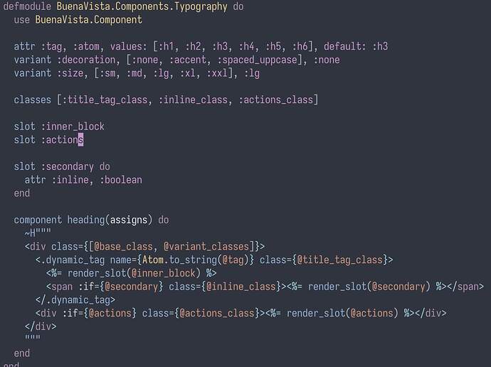
Components are a super set of phoenix components with two additional macros: variant and classes (well, also component, I couldn’t override def, as phoenix already does that).

These two macros are used to describe how the component can change depending on either code calls aka, size={:sm} or what class name are to be used for an inner element. Which brings me to the next part

Nomenclators

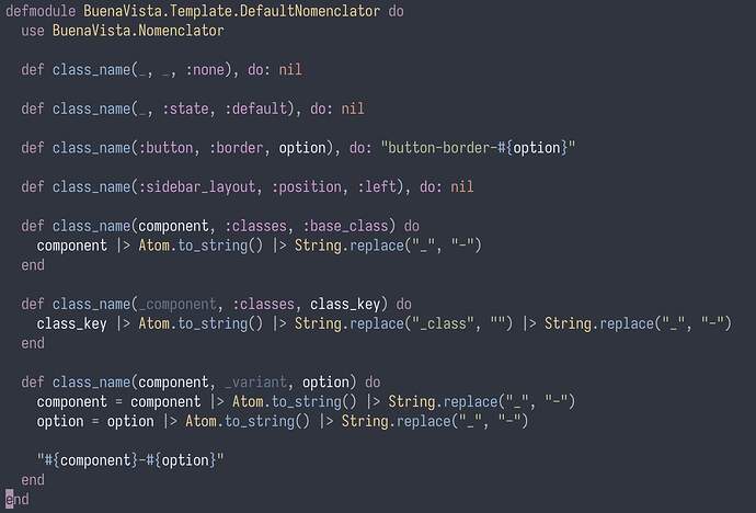
Nomenclators responsability is to give class names to components and it’s sub elements.

This is the default nomenclator, that spits classes like btn btn-sm btn-outline btn-primary. If you check out the code, class_name/3 can be either _component, _variant, _option, used to variant class names or _component, :classes, _class_name that gives names to classes macros defined in the component.

You can see how just with this, you could just add tailwind inline classes and forget about the next part:

Hydrators

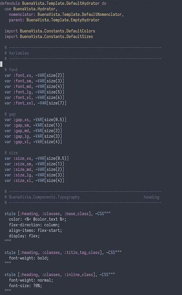
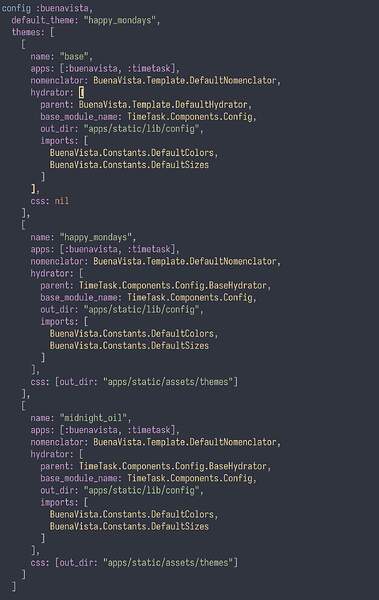
Hydrators responsability is to Hydrate with css the skeleton that nomenclators create. They are auto generated based on: the apps it should go look for components, the parent hydrator and a nomenclator.

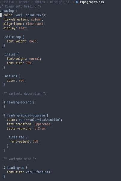
This is a very early stage of the DefaultHydrator that users will be able to use as a base.

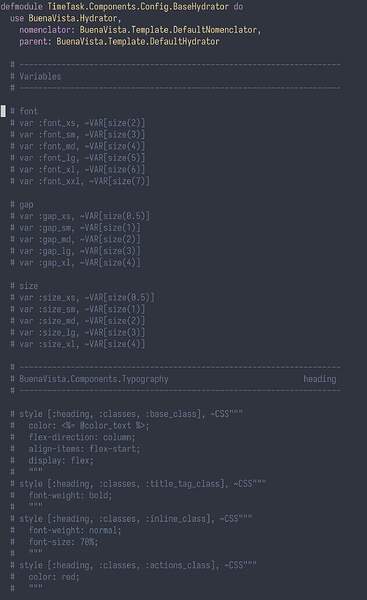
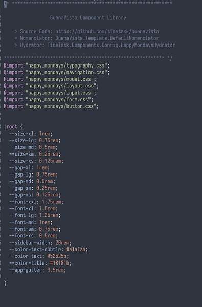
Next is the auto generated version of a hydrator that has DefaultHydrator as it’s parent.

A few things to note here:

  • Notice how it brings all the style and var code as comments from the parent (and it’s parent parent), so that you don’t need to go back and forth trying to understand why styles are the way they are.
  • variables can be then injected into ~CSS sigils
  • If you modify a sub hydrator the engine is smart enough not to crush the changes. Hydrators are constantly being regenerated.
  • ~CSS sigils sorts and properly indents properties with a custom formatter.
  • A main focus of this is to have many many themes for my app, and reuse style code as much as possible.

Finally there are a few mix tasks to generate all the files.

Right now I’m working on two things:

  1. Not your classic component gallery. You’ll not only be able to see all components and it’s possible variations, but have complete access to all variables and css code, so you can edit them right there in your browser, and have those changes be reflected on your code and compiled to css live.
  2. Actually implement some damn components.

There are more things about this library, but that’s the gist. Oh, and it’s called BuenaVista.

Let me know if you’d interested in collaborating :wink:

4 Likes

Hey @fceruti :wave:

First of all, I love the name :slight_smile: — It’s awesome to see there’s more thinking going into improving the state of the art of in-code styling. There are some similarities with how I was envisioning this library, so let me share the ideas that I had to see if it’d make sense to collaborate (and maybe converge them?) or rather have two different solutions to address similar needs.

  • I was thinking about making themes a first-class citizen of the solution. Developers would have an API to define the schema of their themes and have APIs to associate the theme to a connection and even swap it without a full-reload of the page by leveraging LiveView APIs. Under the hood, it’d map the theme to CSS variables that the generated-CSS would reference to. I’d use something like theme-ui as a reference.
  • Responsiveness would also get codified into the APIs similar to how Radix UI does it. Values can either take an absolute value, an array of values, or a map that maps values to different breakpoints. Through CSS queries at runtime the right value would be picked. The breakpoints would get configured at the theme level.
  • Class names would get auto-generated. I believe this is where there’s a lot of overlap with your proposed solution and the concept of nomenclators. I don’t like having to think about class names when it’s something that can be inferred from the module and the component function name.
  • The APIs would encourage developers to codify state using ARIA Attributes as proposed by Endure CSS.

And that’s pretty much it:

  • Consistency through themes.
  • Not having to think about coming up with class names.
  • Not having to think about writing CSS variables (inferred from themes)
  • Not having to think about writing media queries.

Do you think these are ideas that we can converge?

This is actually the main motivation for this library. This is how you’d configure themes in your project.

Note that you can define a parent Hydrator and only modify it’s variables, pretty much what I quickly saw from theme-ui.

You can create break point variable and use it directly in the theme

var :breakpoint_sm, "500px"

style [:component, :classes, :base_class], ~CSS"""
  @media screen and (min-width: <%= @breakpoint_sm %>) {
     ...
  }
"""

Yup :slight_smile:

I hadn’t thought about this, but it’s completely possible as it only touches the BuenaVista.Component module and it’s macros. It could be an argument for the variant macro, if you expect this to be a class name variant or an attribute one. This also opens the possibility to other html attributes.

PS: This is an example of the generated CSS (the actual css is rubbish ATM)

Yeah, I like it too. I even bought buenavista.dev.

Sure, there are many design decisions that shape this kind of tool. It would be awesome to pool resources, but I totally get if the kind of decision I made don’t make sense to you. Having said that, I really just want to have a library that makes is a contribution to the community, and in my wildest dreams, a reason why people choose Elixir/Phoenix over other language/framework combo.

I’m not particularly invested in the implementation.

1 Like

CVA does something similar.

https://hexdocs.pm/cva/CVA.Component.html

1 Like

The CVA approach is a little bit more barebones / minimal.

Have been using styled components based approaches a lot in react-based apps but since I rarely found the need for it anymore since using utility based classes (like tailwind).

I’d be happy if you give it a try.

I can’t commit much time to it but let me know how I could help with the project :slight_smile:

That’s great, even as a second pair of critical eyes, would be of great benefits. I’ll dm you this week.

Btw, the same invitation goes to anyone interested.