
cschmatzler
Turboprop - Toolkit to create accessible component libraries
Hey all!
There’s been a lot of conversation lately both around server/client-side interactivity and a bunch of component libraries popping up for Phoenix. That’s great - and if we’re honest, many of the components that are available for Phoenix are not fully accessible. It’s a hard problem to solve, with keyboard interaction, focus trapping, ARIA labeling and more to keep in mind.
Thankfully, it’s a mostly solved problem in the JavaScript world, with libraries like HeadlessUI, Radix and… Zag, which is a framework-agnostic library packing a bunch of state machines to build accessible components.
So I’ve gone on a mission to create some Phoenix hooks that wrap these state machines, and a handful (not nearly enough at the moment!) are ready to see the light of day.
Along the path, I realised that I want a way to easily write different variants for my components, and, given that overrides are needed, also intelligently merge Tailwind classes to avoid conflicts.
So, this small idea turned into a whole toolkit that offers accessibility-enabling hooks, a variant API and Tailwind class merging utilities.
It’s called Turboprop, it’s still extremely early with especially the hooks API probably changing a lot in the near future, but I’m excited for it, so it’s time to share it!
Here’s a bunch of examples:
Variants
@variants %{
  variants: %{
    variant: %{
      default: "bg-primary text-primary-foreground shadow hover:bg-primary/90",
      destructive: "bg-destructive text-destructive-foreground shadow-sm hover:bg-destructive/90",
      outline: "border border-input bg-background shadow-sm hover:bg-accent hover:text-accent-foreground",
      secondary: "bg-secondary text-secondary-foreground shadow-sm hover:bg-secondary/80",
      ghost: "hover:bg-accent hover:text-accent-foreground",
      link: "text-primary underline-offset-4 hover:underline",
    },
    size: %{
      default: "h-9 px-4 py-2",
      sm: "h-8 rounded-md px-3 text-xs",
      lg: "h-10 rounded-md px-8",
      icon: "h-9 w-9",
    },
  },
}
variant(@variants, variant: "destructive", size: "sm")
"bg-destructive text-destructive-foreground shadow-sm hover:bg-destructive/90 h-8 rounded-md px-3 text-xs"
Merge
merge(["px-2 py-1 bg-red hover:bg-dark-red", "p-3 bg-[#B91C1C]"])
"hover:bg-dark-red p-3 bg-[#B91C1C]"
Hooks
<div {dialog()}>
  <button
    class="rounded-md bg-blue-500 px-3 py-1.5 text-sm text-white shadow-sm hover:bg-blue-400 focus-visible:outline focus-visible:outline-2 focus-visible:outline-offset-2 focus-visible:outline-blue-500"
    {dialog_trigger()}
  >
    Open dialog
  </button>
  <div class="absolute inset-0 w-full h-full bg-gray-200" {dialog_backdrop()}></div>
  <div class="fixed inset-0 z-10 w-screen overflow-y-auto flex min-h-full items-center justify-center p-4" {dialog_positioner()}>
    <div class="w-full max-w-md rounded-xl bg-white p-6 outline-0" {dialog_content()}>
      <h2 class="text-base font-medium" {dialog_title()}>Dialog</h2>
      <span class="mt-2 text-sm" {dialog_description()}>Welcome!</span>
      <div class="mt-4">
        <button
          class="rounded-md bg-blue-500 px-3 py-1.5 text-sm text-white shadow-sm hover:bg-blue-400 focus-visible:outline focus-visible:outline-2 focus-visible:outline-offset-2 focus-visible:outline-blue-500"
          {dialog_close_trigger()}
        >
          Close
        </button>
      </div>
    </div>
  </div>
</div>
I’ll be adding a bunch more hooks in the future, probably revisiting the hooks API and options, documentation is a work in progress as always… The entire thing is less than two weeks old, so it’ll be a bit before we’re reaching 1.0!
Let me know if there’s a hook you really want to see next, or if something is desperately missing in the documentation, or just let me know you’re gonna use this in your projects!
Maybe, just maybe, there’ll be a component library from me as well soon.
Most Liked

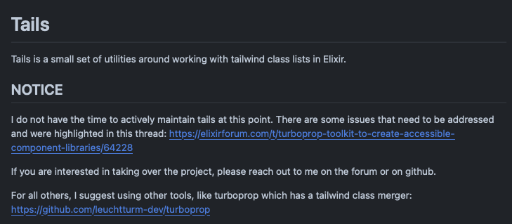
zachdaniel
I’ve soft-deprecated tails, primarily based on the issues your tests pointed out, and point folks at turboprop instead  I spent ~2 hours fixing it, and got some of the issues addressed, before I remembered that I maintain like 50 packages at this point and I just don’t realistically have the time to actually fix tails

Flo0807
Thanks for your work! The package looks very promising.
I’d love to see a Combobox hook.
cschmatzler
Surprise!
https://hexdocs.pm/turboprop/Turboprop.Hooks.Combobox.html
0.4 contains a ton of breaking changes (again, still playing around and experimenting a lot so don’t use this in a real project just yet), but also Accordion and Combobox components and a change to TypeScript which is nice I guess.
Take it for a rest ride and let me know if anything smells!
Popular in Announcing


Other popular topics


 Latest Phoenix Threads
Latest on Elixir Forum
Sponsor Spotlight

We build reliable cloud platforms for business-critical systems.
Categories:
Sub Categories:
Forums
Our Sponsors

Build Elixir applications with speed and confidence.

Supporting innovation across the BEAM ecosystem.
We build reliable cloud platforms for business-critical systems.

Catch errors, track performance, monitor hosts and more.

Practical resources that improve the lives of professional developers.

Producing high quality Elixir screencasts since 2017.

Enabling companies to succeed by building software people love.

Courses that'll move you from confusion to "Aha, now I get it!"