Hi community,
I am trying to plot a line graph with Elixir’s ContEx charting system. I’m assigning the dataset with Dataset.new/1, before assigning the chart with LinePlot.new/2 and rendering the SVG with Plot.new/3. The data I’m passing into Dataset.new/1 is formatted as {x_value, y_value}.
[
	{1, 10.1},
	{2, 10.1},
	{3, 8.5},
	{4, 6.0},
	{5, 0.0},
	{6, 0.0},
	{7, 0.0},
	{8, 0.0},
	{9, 0.0},
	{10, 0.0}
]

---
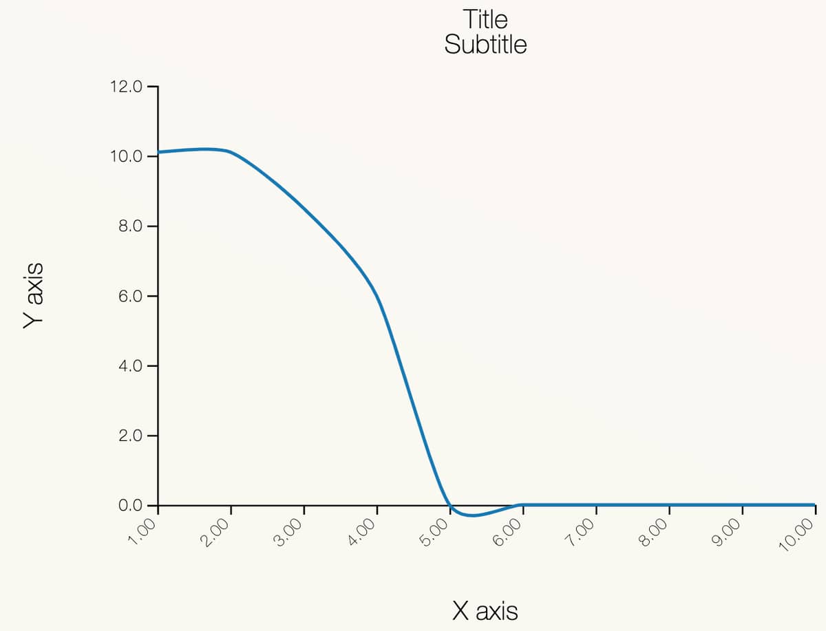
The issue is that the plotted line graph will either dip below or rise above the actual value. Eg. The line rises slightly from x=1 to x=2 even though both y-values should be 10.1. Similarly, the line dips slightly below 0 from x=5 to x=6, even though both y-values should be 0.
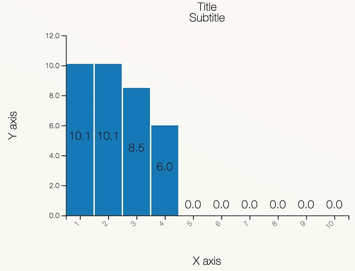
When I use the same data to plot a bar chart with BarChart.new/2 instead of LinePlot.new/2, the chart appears to be correct.
Here are the code snippets that may be causing the issue.
barchart_helper.ex:
defmodule MyWeb.Helpers.BarchartHelper do
  alias Contex.{Dataset, BarChart, Plot, LinePlot}

  def make_bar_chart_dataset(data), do: Dataset.new(data)

  def make_pipeline_chart(dataset) do
    LinePlot.new(dataset) # or BarChart.new(dataset) to plot a barchart
  end

  def render_bar_chart(chart, title, subtitle, x_axis, y_axis) do
    Plot.new(500, 400, chart)
    |> Plot.titles(title, subtitle)
    |> Plot.axis_labels(x_axis, y_axis)
    |> Plot.to_svg()
  end
end
test_chart.ex:
defmodule MyWeb.TestLive.TestChart do
  use MyWeb, :live_component
  use MyWeb, :chart_live

  def update(%{total_resources: total_resources} = assigns, socket) do
    {:ok,
     socket
     |> assign(assigns)
     |> assign(:total_resources, total_resources)
     |> assign_dataset()
     |> assign_chart()
     |> assign_chart_svg()}
  end

  def assign_dataset(%{assigns: %{total_resources: total_resources}} = socket) do
    socket |> assign(:dataset, make_bar_chart_dataset(total_resources))
  end

  def assign_chart(%{assigns: %{dataset: dataset}} = socket) do
    socket |> assign(:chart, make_pipeline_chart(dataset))
  end

  def assign_chart_svg(%{assigns: %{chart: chart}} = socket) do
    socket
    |> assign(
      :chart_svg,
      render_bar_chart(chart, "Title", "Subtitle", "X axis", "Y axis")
    )
  end

  def render(assigns) do
    ~H"""
    <div>
      <%= @chart_svg %>
    </div>
    """
  end
end
Thank you in advance.
Best wishes,
Jing Hui P.


