
mplatts
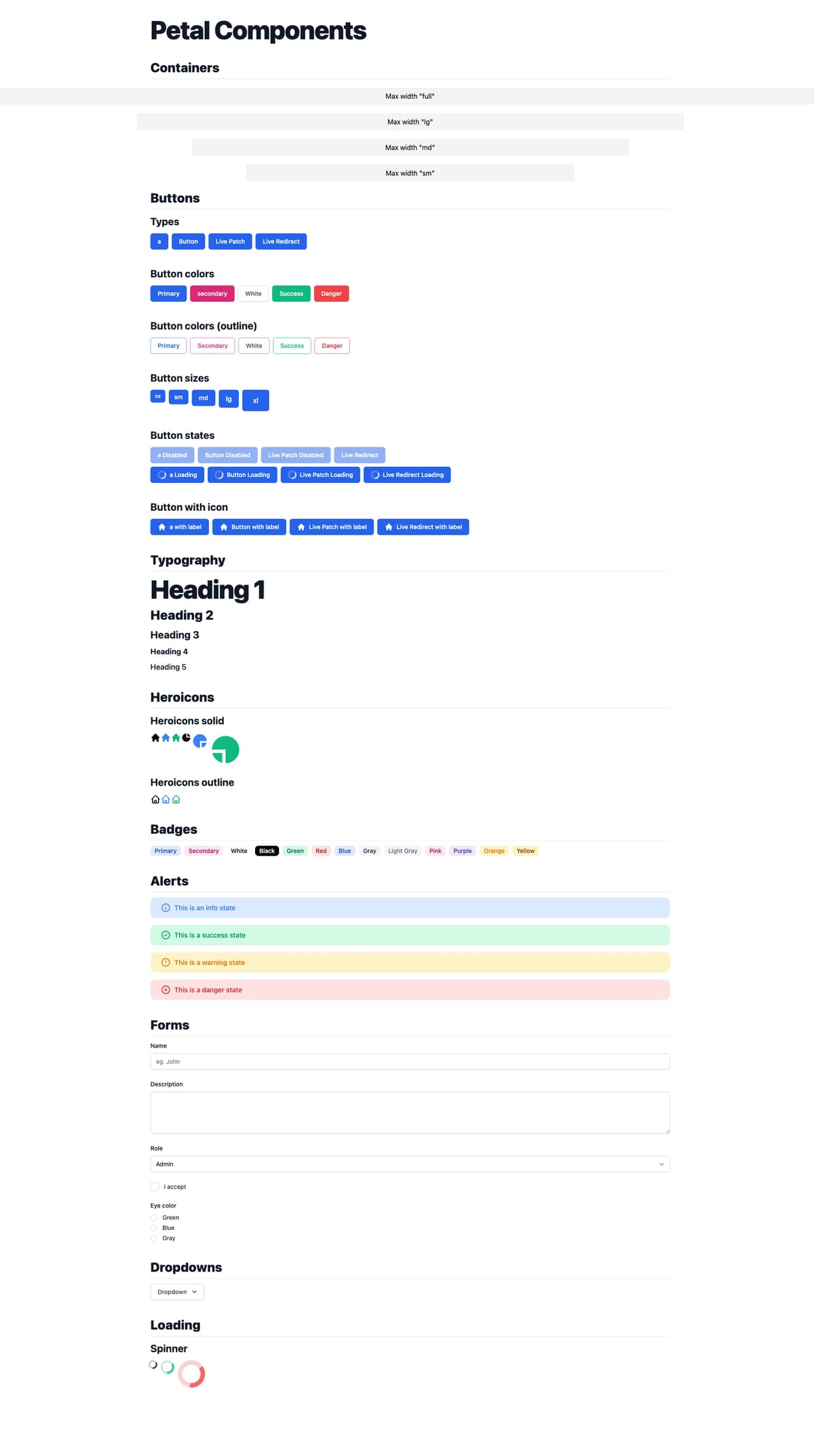
"Petal Components" package - a set of Tailwind styled components written in HEEX
With HEEX released we decided to start a components library using Tailwind CSS - check it out here: Petal Components.
We also have a boilerplate project if you want to get up and running quickly - it’s just a fresh install of Phoenix with Tailwind/Alpine and petal_components included.
Petal Components allows you to get up and running with a suite of styled components eg:
<Container.container>
  <Typography.h1>Petal Components</Typography.h1>
  <Button.a href="/" label="a" />
  <Button.button label="Button" />
  <Button.patch href="/" label="Live Patch" />
  <Button.redirect href="/" label="Live Redirect" />

  <!-- Includes every single heroicon -->
  <Heroicons.Solid.home class="w-5 h-5" />

  <!-- Includes all the basic form elements. eg: -->
  <Form.text_input form={:user} field={:name} placeholder="eg. John" />
  <Form.textarea form={:user} field={:description} />

  <!--Plus much more -->
</Container.container>
We plan to add more components over time and eventually add a “pro” (paid) version that adds things like styled authentication pages / Stripe integration / email templates etc… Does this sound like something you guys would be interested in?
We welcome your thoughts or any ideas for components. Cheers
Most Liked

nhoban
Hi everyone!
I’m the other developer contributing to Petal. We’re pleased to announce our new docs page has gone live!


You can check it out now here: petal.build
There’s live demo’s of all the components and code snippets you can directly copy and paste into your projects - soon you’ll be able to download the boilerplate (hopefully over the coming week or two). We’d really welcome your feedback on both the new site and boilerplate (when the latter becomes available).
New update to Petal Components - v0.9.0
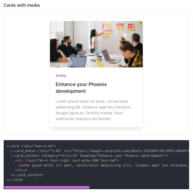
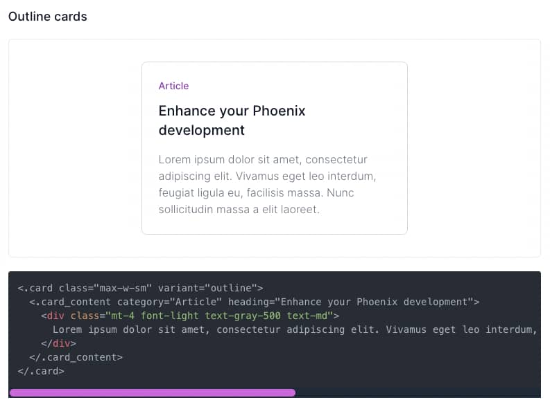
Card


chrismccord
This is super great! I have a bunch of similar components in my own apps. My one big suggestion would be to consolidate the modules. You could likely have a single module with the current surface area. One of the goals of function components was to push folks away from the one-function-per-module for component pattern. By grouping the functions, they are more discoverable, doc’d in one place, etc. For example, folks could import PetalComponent (or single alias) and have most core UI components available as <.link, <.button. I’m not saying everything must be define under the same namespace, but the current surface area would be really well suited and would be nice in user land. Awesome work!
mplatts
New version release (v0.5)
New form field types
Now every form field type is supported.
<.email_input form={f} field={:email_input} />
<.number_input form={f} field={:number_input} />
<.password_input form={f} field={:password_input} />
<.search_input form={f} field={:search_input} />
<.telephone_input form={f} field={:telephone_input} />
<.url_input form={f} field={:url_input} />
<.time_input form={f} field={:time_input} />
<.time_select form={f} field={:time_select} />
<.datetime_local_input form={f} field={:datetime_local_input} />
<.datetime_select form={f} field={:datetime_select} />
<.color_input form={f} field={:color_input} />
<.file_input form={f} field={:file_input} />
<.range_input form={f} field={:range_input} />
Progress bars

<.progress color="primary" value={15} max={100} class="max-w-xl" />
<.progress color="secondary" value={30} max={100} class="max-w-xl" />
<.progress color="info" value={45} max={100} class="max-w-xl" />
<.progress color="success" value={60} max={100} class="max-w-xl" />
<.progress color="warning" value={75} max={100} class="max-w-xl" />
<.progress color="danger" value={90} max={100} class="max-w-xl" />
Pagination
Links can be live_patch or live_redirect. Automatically adds the ellipsis so you can have unlimited pages (inspired by Material UI).

<.pagination link_type="a" class="mb-5" path="/:page" current_page={1} total_pages={10} />
<.pagination link_type="live_patch" class="mb-5" path="/:page" current_page={5} total_pages={10} />
<.pagination link_type="live_redirect" class="mb-5" path="/:page" current_page={10} total_pages={10} />
Popular in Announcing


Other popular topics


 Latest Phoenix Threads
Latest on Elixir Forum
Sponsor Spotlight

Producing high quality Elixir screencasts since 2017.
Categories:
Sub Categories:
Forums
Popular Tags
- #ecto
- #liveview
- #troubleshooting
- #learning-elixir
- #deployment
- #library
- #erlang
- #testing
- #genserver
- #mix
- #absinthe
- #remote-other
- #otp
- #plug
- #how-to-question
- #macros
- #postgres
- #channels
- #elixirconf
- #exunit
- #discussion
- #code-sync
- #javascript
- #podcasts
- #onsite
- #dialyzer
- #docker
- #authentication
- #umbrella
- #full-time-contract
- #podcasts-by-brainlid
- #ecto-query
- #elixir-ls
- #phoenix_html
- #iex
- #blog-post
- #graphql
- #genstage
- #ai
- #websockets
- #supervisor
- #advent-of-code
- #elixirconf-us
- #distillery
- #processes
- #forms
- #api
- #metaprogramming
- #security
- #performance
Our Sponsors

Build Elixir applications with speed and confidence.

Supporting innovation across the BEAM ecosystem.

We build reliable cloud platforms for business-critical systems.

Catch errors, track performance, monitor hosts and more.

Error tracking for Elixir devs who love to ship. Start your free account.

Practical resources that improve the lives of professional developers.
Producing high quality Elixir screencasts since 2017.

The deployment platform built for Elixir: PaaS ease, VPS control.

The team behind Membrane, Popcorn, LiveDebugger. Available for hire.

Courses that'll move you from confusion to "Aha, now I get it!"