"Petal Components" package - a set of Tailwind styled components written in HEEX

Just deployed Petal Components to Fly, so you can easily refer to our components at a glance:

https://petal-components-demo.fly.dev/

Here’s a thread we made about deploying to Fly:

We’ve also added a dark mode toggle to the nav bar in Petal Components so you can seamlessly switch between light/dark mode as you scroll down the page.

You can find full Petal Components documentation at:

Install.

If you have any suggestions for future components you’d use in your projects, we’d love to hear them!

3 Likes

These are great, thanks!

One detail I noticed, on the new demo, the first dropdown gets cut off on the left-hand side by the limit of the browser. I’m on Mac, tried Firefox and Safari.

Might start to use these!

2 Likes

Same on mobile.

You might want to change the href="/" on the tabs etc so when someone clicks it they don’t get taken to the top of the page + reload the whole page.

File input w/error. If you round the corners of the element with the red background you might be able to clip the little red corners you get on the LHS of the button.

With regards to the JS modal component, is that actually a JS modal? It triggers the topbar page loading indicator and is very slow to display.

You might want to delay the page loading indicator as per the fly.io blog so it doesn’t appear so slow.

3 Likes

Great feedback! We will be sure to implement all this. The modal is triggered by a live_patch … not sure you can make a modal load instantly unless you had all the insides of the modal ready to go. But usually you’d want to do some kind of database call in the handle_params call.

1 Like

Yeah, the way I see it there are two types of modal. The type you describe and the one where you know the contents prior, which you can trigger with the JS commands. I assumed it was the second type due to the title of the page.

One other thing was in dark mode, the range slider is all grey. Maybe a coloured handle would make it look like it’s not disabled.

Pretty slick looking components :sunglasses:

This is quite an interesting project. Phoenix.Component is such a great abstraction, it works really well in combination with heex templates.

I have some thoughts about Phoenix/Liveview in general but not quite sure how to sum them up yet :joy:

I think we are in a bit of a tough spot with Phoenix/LiveView when it comes to building more advanced frontend components.

  • LiveView is great but I think when a component mostly consist of frontend interactions and does not need the backend, then LiveView is an anti pattern since it introduces the possibility of lag/latency.
    • This applies to modal dialogs too (since you need JS anyway to disable document scrolling, animation, etc.). Hitting a close button should always just work even when offline.
  • Alpine.js get’s messy (beyond simple components)
  • Stimulus.js is great but you are still writing a lot of code (it would work for modals, but not for even more advanced components, like multi select)

Another option is to wrap a React component in Stimulus, and render via Phoenix.Component, like so:

  • Make a Phoenix Component with a multi_select/1 function
  • Attach Stimulus controller (data-controller="multi-select")
  • Render Mantine’s <MultiSelect .. /> via ReactDOM in connect() of Stimulus controller
  • Some extra stuff to make it read/write value from hidden <select> element.
  • Render via <.multi_select form={...} field={...} options={...} />

It would be cool if we could leverage what is already available in React but still render it server-side, somehow. Then you could just write <MultiSelect …/> in a server side template, and it would get rendered server-side and rehydrated (kinda like Next.js) when you load the page.

I suppose my point is we are rebuilding part of what is already available in many of the great React UI libraries (such as https://mantine.dev/), but with lesser tools (tools less suitable for the job such as LiveView and Alpine.js).

These are just my thoughts as someone who enjoys writing frontend and backend code, but still prefers server-side rendered applications. Would love to hear about your thoughts.

1 Like

Nice thoughts @thomasbrus. In that sense may be svelte fits the bill better than React. It is disappearing framework :slight_smile:
But this, rebuilding is something that is a bit of concern to many I guess. May be webcomponents?
But undoubtedly, we are moving towards OnePersonFrameworks. Exciting times to be a Web App Developer.

1 Like

This isn’t true. We have the JS interface as well as javascript hooks for handling purely client side interactions. Try out the tailwindUI dropdown on LiveBeats:
https://livebeats.fly.dev/chrismccord

It features purely client-side interaction (no server trip), and it is fully accessible (keyboard nav, focus handling etc). So LiveView component libraries can be released to fully handle these kinds of things without React et al.

<.dropdown id={@id}>
  <:img src={@current_user.avatar_url}/>
  <:title><%= @current_user.name %></:title>
  <:subtitle>@<%= @current_user.username %></:subtitle>

  <:link navigate={profile_path(@current_user)}>View Profile</:link>
  <:link navigate={Routes.settings_path(Endpoint, :edit)}>Settings</:link>
  <:link href={Routes.session_path(Endpoint, :sign_out)} method={:delete}>
    Sign out
  </:link>
</.dropdown>
10 Likes

Thanks @chrismccord. Wanted to answer in similar lines. I mean, I knew, for JS interface no server side trip is necessary. But, I am glad I didn’t. We could hear from horse’s mouth. :slight_smile:
So now, we need component library - and - set of generators which use the same set of components. That will give a huge momentum.

3 Likes

That’s neat, I had briefly looked at LiveView.JS but I was under the impression that it went over the wire but I see now it does not :slight_smile:

2 Likes

I agree.

I’ve been following this Petal Components library closely for a while now and have been thinking about purchasing the Petal PRO mostly for the generators using Petal Components (I’m really just waiting for the phx.gen.auth wrappings @mplatts & @nhoban).

But also browsing through the LiveBeats LiveView components code there are some slight differences, and an “official standard” component library would be preferred.

My .02

2 Likes

I could see updates to a component library iterating much more frequently that the core Phoenix project so I think an “official” library might introduce an unreasonable maintenance load on the core team and potentially slow down innovation.

I think the authors of the Petal Components library are moving pretty quickly so perhaps it will become the de-facto go-to library?

2 Likes

It’s my hope with HEEx and function components we’ll see more and more full-featured component libs (like petal), and that they will ship fully accessible components, so doing the right thing is the default for standard components. We know that developers won’t ship accessible features if it takes extra effort (unless they are forced), so a <.dropdown, <.modal, etc that just happens to be accessible out-of-the-box is the happy destination I hope we arrive at :slight_smile:

10 Likes

Yes, Kip and Chris explained what I meant much more eloquently than my use of quotes for “official standard” component library.

The petalframework crew is doing a fantastic job of cranking out updates and implementing user feedback.

There are too many component frameworks for the Phoenix core team to be too involved or manage, but adding to what Chris said maybe a checklist / test suite to ensure all the accessibility and best-practice requirements are met for a component library to be “blessed as official” is probably more what I meant. But that’s also what we are doing here as a kind of community review board.

3 Likes

I fiddled around a bit more yesterday with my Phoenix.Component → Stimulus → React idea. (I don’t know if this is the best place to share it, but in case anyone is going down the same path, here it goes):

  • components/form_component.ex:
    this just calls a react/1 function component with controller (name of the Stimulus controller) and props (a map of props that will be provided to the React component):
  def multi_select(assigns) do
    ~H"""
    <.react controller="multi-select" props={extra_attributes(assigns)}>
      <%= Phoenix.HTML.Form.multiple_select(@form, @field, @options, class: "multi-select__select", data: [multi_select_target: "select"]) %>
      <div data-multi-select-target="component"></div>
    </.react>
    """
  end
  • components/react_component.ex:
    pretty straightforward also, outputs something like <div data-controller=“multi-select” data-multi-select-props-value={…} />`
defmodule MyAppWeb.ReactComponent do
  use Phoenix.Component
  import Phoenix.Naming, only: [camelize: 2]
  @react_props %{class: :class_name}

  def react(assigns) do
    assigns = assigns |> assign(:data, controller: assigns.controller, "#{props_key(assigns)}": props_value(assigns))

    ~H"""
    <div data={@data} class="react">
      <%= if @inner_block do %><%= render_slot(@inner_block) %><% end %>
    </div>
    """
  end

  defp props_key(assigns) do
    "#{assigns.controller}-props-value"
  end

  defp props_value(assigns) do
    assigns.props
    |> Enum.map(fn {key, value} -> {Map.get(@react_props, key, key), value} end)
    |> Enum.map(fn {key, value} -> {camelize(to_string(key), :lower), value} end)
    |> Map.new()
    |> Jason.encode!()
  end
end
  • stimulus_controllers/multi_select_controller.jsx
    and then this connects the 3rd party React component to the DOM:
import { MultiSelect } from '@mantine/core';

export default class extends Controller {
  static values = { props: Object };
  static targets = ['select', 'component'];

  connect() {
    ReactDOM.render(
      <MultiSelect ...  data={this.options}  onChange={this.handleChange} />,
      this.componentTarget
    );
  }

  disconnect() {
    ReactDOM.unmountComponentAtNode(this.componentTarget);
  }

  handleChange = (values) => { ... };
  get options() { ... }
  // ... more stuff here ...
}

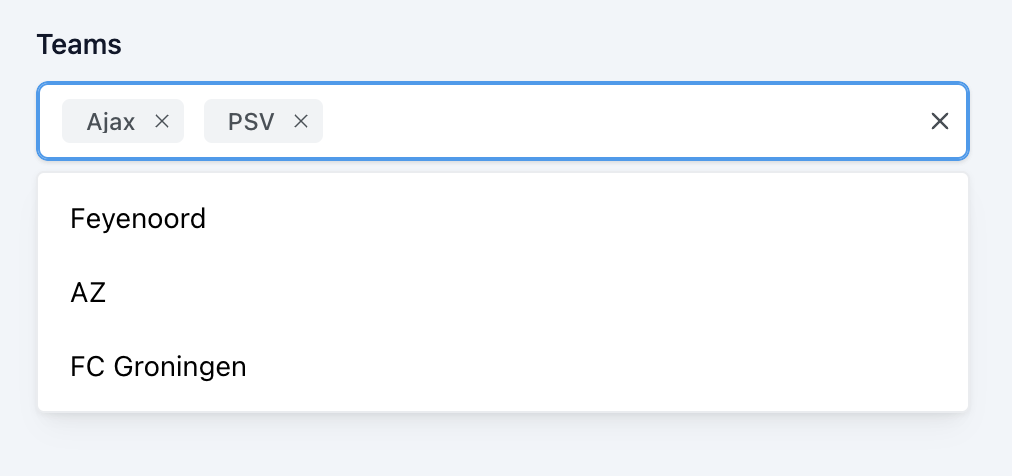
And it looks like this:

This is just 1 approach to implement such a more advanced component. At the end of the day it’s nice to have a function component (<.multi_select ... />) that you can call without worrying (too much) about it’s implementation. It happens to be fully accessible also.

Only thing I’m not happy with is that it is stil bringing in quite a bit of javascript and I have to make sure the integration works well enough :thinking: For example supporting grouped select options will be a bit more code. I have also not tested it in a morphdom setting (just single render for now).

I can also see the appeal of implementing such components via LiveView / LiveView.JS or Alpine.js. It will obviously result in more code when building it from the ground up but it won’t have a dependency on React/Node/etc.

1 Like

While this sounds nice at least accessibility is not as simple as a checklist to deal with. There‘s not s „correct“ way of doing it. Even the official aria docs afaik are full of examples, but not prescriptions or how tos. There‘s a lot more gray in that topic than black and white.

2 Likes

But there can be “good defaults” right ? Never had to deal with accessibility myself until now. So, I don’t understand how ‘difficult’ is it define ‘sane defaults’.

2 Likes

There are for sure some generalizable rules, mostly on the smaller scale, but there’s no “this is how you make your calendar component accessible”.

2 Likes

New update to Petal Components - v0.13.4

Table

Find the full documentation at: Table

3 Likes

FYI, I think :label and :sub_label should be excluded here:

label