Thanks for pointing this out, just pushed a fix.
2 Likes
Just curious by the way, have you considered using BEM classes? So a button component would get a .button.button--primary class for example instead of utility classes.
Asking this because it would be nice not having to use !important when overriding styles, as described here: Modifying_components. Since this increases the CSS specificity.
This would also enable other niceties such as theming via CSS vars:
.button {
  --primary-color: #abcdef;
}
I understand the goal is of course that the styling works out of the box with as little setup as possible. However if the developer is already using Tailwind they could import the stylesheets from ./deps/petal_components (I think) and it would “just work”, no need for an NPM package.
By the way I’m currently using this package with some of my own components mixed and it works quite nicely 
Hi @thomasbrus,
Thanks good suggestion. I’ve wondered if that could be a superior option - something like daisyui - especially for certain elements like buttons. One problem is it might fall down with more complex components like <.dropdown> or <.pagination>, where we want to abstract away where to put the divs and spans and in what order etc. So it might be slightly more confusing to have some components where you use a BEM class, and some you just use a HEEX component.
I need to learn more about CSS vars - can you explain why that is better than defining the “primary” color in the tailwind config (theme.extend.colors.primary)?
Ah yes what you’re saying is expose BEM classes only right? I agree that would fall apart with more complex components.
What I meant only affects the implementation. End users still use HEEX but the implementation wise you’d use BEM classes instead of utility classes (which are the reason currently !class is needed to override styles).
So implementation wise it would look something like this:
  def button(assigns) do
    assigns = assign(assigns, :class, fn -> ["button", button_intent_class(assigns.intent), @class] end)

    ~H"""
    <button class={@class} {@extra}>
      <%= render_slot(@inner_block) %>
    </button>
    """
  end

  def button_intent_class("primary"), do: "button--primary"
  def button_intent_class("success"), do: "button--success"
  def button_intent_class("danger"), do: "button--danger"
And the corresponding CSS would be:
@layer components {
  .button {
    padding: theme('padding.2');
    /* etc */
  }

  .button--primary {
    background: theme('colors.green.500');
    /* etc */
  }
}
Then you could use the button as follows:
<.button intent="primary" class="p-3 text-red-500">Special button</.button>
Outputs:
<button class="button button--primary p-3 text-red-500">... etc ...
In Tailwind the components layer always comes before utilities so it has a lower specificity in CSS, so no need for !p-3 (important). Also think it would cleanup the petal codebase a bit but that is up to you two to decide of course.
I need to learn more about CSS vars - can you explain why that is better than defining the “primary” color in the tailwind config (theme.extend.colors.primary)?
I mentioned CSS vars mostly because when you separate the styling from the components you can reference CSS vars for additional customization. When all styles are inlined via utility classes this is not as easy.
You could also provide a default value for primary so that users don’t need to modify their tailwind.config.js for it to work. On the other hand you can also expose a Tailwind preset. So lot’s of options there 
3 Likes
Ohh I see now… that looks great - you’re all over it  . We’ll definitely look into this - might ping you when we have a PR ready to have a look over it if that’s okay
2 Likes
I like the css vars approach. I looked at Daisy UI and their use of vars and I put this in my head:
    :root {
      --primary: 70 100% 10%;
      --primary-focus: 70 100% 15%;
      --primary-content: 70 100% 90%;
      --secondary: 140 100% 20%;
      --secondary-focus: 140 100% 40%;
      --secondary-content: 140 100% 80%;
      --accent: 210 100% 20%;
      --accent-focus: 210 100% 40%;
      --accent-content: 210 100% 80%;
      --neutral: 10 100% 10%;
      --neutral-focus: 10 100% 15%;
      --neutral-content: 10 100% 90%;
      --base-100: 35 100% 95%;
      --base-200: 35 100% 90%;
      --base-300: 35 100% 80%;
      --base-content: 35 100% 20%;
      --info: 240 100% 10%;
      --info-content: 240 100% 90%;
      --success: 69 100% 20%;
      --success-content: 69 100% 20%;
      --warning: 69 100% 20%;
      --warning-content:69 100% 20%;
      --error:0 100% 10%;
      --error-content: 0 100% 90%;
      --rounded-box: 0.25rem;
      --rounded-btn: 0.125rem;
      --rounded-badge: 0.125rem;
      --animation-btn: 0;
      --animation-input: 0;
      --btn-focus-scale: 1;
      --tab-radius: 0;
    }
then here’s an excerpt of tailwind config:
theme: {
    colors: {
      primary: "hsl(var(--primary))",
      "primary-focus": "hsl(var(--primary-focus))",
      "primary-content": "hsl(var(--primary-content))",
      secondary: "hsl(var(--secondary))",
      "secondary-focus": "hsl(var(--secondary-focus))",
      "secondary-content": "hsl(var(--secondary-content))",
      accent: "hsl(var(--accent))",
      "accent-focus": "hsl(var(--accent-focus))",
      "accent-content": "hsl(var(--accent-content))",
      neutral: "hsl(var(--neutral))",
      "neutral-focus": "hsl(var(--neutral-focus))",
      "neutral-content": "hsl(var(--neutral-content))",
      "base-100": "hsl(var(--base-100))",
      "base-200": "hsl(var(--base-200))",
      "base-300": "hsl(var(--base-300))",
      "base-focus": "hsl(var(--base-focus))",
      "base-content": "hsl(var(--base-content))",
      info: "hsl(var(--info))",
      "info-focus": "hsl(var(--info-focus))",
      "info-content": "hsl(var(--info-content))",
      success: "hsl(var(--success))",
      "success-focus": "hsl(var(--success-focus))",
      "success-content": "hsl(var(--success-content))",
then in each component I can’t use bg-gray-500 or whatever. It forces me to use bg-base-100 and text-base-content. The advantage is color use is pretty consistent/branded. It’s also very easy to theme as we know from daisyUI.
I went and used hsl for colors… not sure if that’s the right plan or not… that’s just what I ended up choosing for the moment. DaisyUI uses hsla at times for opacity.
Just wanted to throw that out there in case that idea is interesting.
4 Likes
I’m experimenting with Petal components for my liveview webapp and have run into a strange behaviour.
In my example I have a standard dropdown component from petal library and a custom dropdown live component (sorting selector), like so:
<div phx-click="toggle_sort" phx-target={@myself}>Sorting</div>
<%= if @sorting.visible do %>
<div>displaying sorting options here</div>
<% end %>
The event that handles this toggle looks like so:
def handle_event("toggle_sort", _params, socket) do
    {:noreply, socket
      |> assign(:sorting, socket.assigns.sorting
        |> Map.put(:visible, !socket.assigns.sorting.visible)
      )}
  end
It seems to be working fine in separation. However, whenever I click on the petal dropdown component, “toggle_sort” event is also triggered. It also happens when I click on a color theme selector (from petal boilerplate project).
I don’t really understand why is this happening. I’d really appreciate if someone could point me to what I should be looking for here?
@anuras you need to post the full code. There are no components visible to us there.
Also, why not use JS to toggle the visibility?
My petal dropdown looks like this (with styling removed for clarity):
<.dropdown>
    <:trigger_element>
        <div>
            <span>
            Dropdown
            </span>
        </div>
    </:trigger_element>
    <.dropdown_menu_item link_type="live_redirect" to={MyAppWeb.Router.Helpers.post_cat_url(MyAppWeb.Endpoint, :cat, "category 1")} label="category 1" />
    <.dropdown_menu_item link_type="live_redirect" to={MyAppWeb.Router.Helpers.post_cat_url(MyAppWeb.Endpoint, :cat, "category 2")} label="category 2" />
</.dropdown>
Not sure if this is enough. To be honest I don’t have much good experience with JS and every time I’m trying to use it I end up dejected after a lot of struggling. As a result I’m actively trying to avoid writing JS myself and try to rely on libraries like this one. Perhaps that’s not a very wise strategy haha 
1 Like
Sorry, I meant Phoenix.LiveView.JS.
Where does your div from the other post fit in?
1 Like
Totally overlooked LiveView.JS. It seems this is exactly what I need and way simpler!
3 Likes
New Update 15.0!
Switch
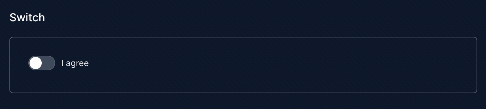
Special thanks to tamanugi for helping get this one across the line 
Full documentation👇
3 Likes
If you are interested in Petal Pro, they are running a discount that ends in a couple days.
For a great run through of all the Petal Pro features, check out their guide. It walks you through creating a little reminder app using Petal Pro:
2 Likes
I’m curious whether Petal Components is compatible with Phoenix 1.7 RC 0?
And, if so, are there any instructions on how to configure a 1.7 app for Petal Components?
1 Like
Yes they are compatible. The only issue is that Petal Components and Phoenix 1.7 both define a <.button> and <.modal> component. So you will either need to delete those from core_components.ex (if you want to use just Petal Components) or change their names so there isn’t a clash.
Thanks for the info!
Are there any instructions for configuring a 1.7 project to use Petal Components?
No not yet - but I’ll try add some in later today.
I believe it would be just following the same instructions but commenting out the modal/button functions in page_component.ex. Any phoenix generator won’t work properly as they’ll use the core_component versions of button/modal. A better way might be to override the button/modal functions and change them to output the petal component versions. I’ll have a play and post in here once some proper instructions are up.
By “same instructions”, what do you mean?
I’m following the video at Petal Components - ElixirCasts to make my changes. Are there alternate instructions somewhere?
I just now encountered the collision problems with button, modal, etc. I’m fixing it by renaming the core components functions to cc_button, cc_modal, etc, and then changing all of the function references.


