You can read the announcement on the blog, but I’ll dup most of it here for discussion purposes:
–––––––––––––––––––––––––––––––––––––––
The first release candidate of Phoenix 1.7 is out! Phoenix 1.7 packs a number of long-awaited new features like verified routes, Tailwind support, LiveView authentication generators, unified HEEx templates, and more. This is a backwards compatible release with a few deprecations. Most folks should be able to update just by changing a couple dependencies.
Note: For the rc period, you’ll need to explicitly install the phx.new generator from hex to try out a fresh project:
mix archive.install hex phx_new 1.7.0-rc.0
Verified Routes
Verified routes replace router helpers with a sigil-based (~p), compile-time verified approach.
note: Verified routes make use of new Elixir 1.14 compiler features. Phoenix still supports older Elixir versions, but you’ll need to update to enjoy the new compile-time verification features.
In practice this means where before you used autogenerated functions like:
  # router
  get "/oauth/callbacks/:id", OAuthCallbackController, :new

  # usage
  MyRouter.Helpers.o_auth_callback_path(conn, :new, "github")
  # => "/oauth/callbacks/github"

  MyRouter.Helpers.o_auth_callback_url(conn, :new, "github")
  # => "http://localhost:4000/oauth/callbacks/github"
You can now do:
  # router
  get "/oauth/callbacks/:id", OAuthCallbackController, :new

  # usage
  ~p"/oauth/callbacks/github"
  # => "/oauth/callbacks/github"

  url(~p"/oauth/callbacks/github")
  # => "http://localhost:4000/oauth/callbacks/github"
This has a number of advantages. There’s no longer guesswork on which function was inflected – is it Helpers.oauth_callback_path or o_auth_callback_path, etc. You also no longer need to include the %Plug.Conn{}, or %Phoenix.Socket{}, or endpoint module everywhere when 99% of the time you know which endpoint configuration should be used.
There is also now a 1:1 mapping between the routes you write in the router, and how you call them with ~p. You simply write it as if you’re hard-coding strings everywhere in your app – except you don’t have maintenance issues that come with hardcoding strings. We can get the best of both worlds with ease of use and maintenance because ~p is a compile-time verified against the routes in your router.
For example, imagine we typo a route:
<.link href={~p"/userz/profile"}>Profile</.link>
The compiler will dispatch all ~p’s at compile-time against your router, and let you know when it can’t find a matching route:
    warning: no route path for AppWeb.Router matches "/postz/#{post}"
      lib/app_web/live/post_live.ex:100: AppWeb.PostLive.render/1
Dynamic “named params” are also simply interpolated like a regular string, instead of arbitrary function arguments:
~p"/posts/#{post.id}"
Additionally, interpolated ~p values are encoded via the Phoenix.Param protocol.
For example, a %Post{} struct in your application may derive the Phoenix.Param
protocol to generate slug-based paths rather than ID based ones. This allows you to
use ~p"/posts/#{post}" rather than ~p"/posts/#{post.slug}" throughout your
application.
Query strings are also supported in verified routes, either in traditional query
string form:
~p"/posts?page=#{page}"
Or as a keyword list or map of values:
params = %{page: 1, direction: "asc"}
~p"/posts?#{params}"
Like path segments, query strings params are proper URL encoded and may be interpolated
directly into the ~p string.
Once you try out the new feature, you won’t be able to go back to router helpers. The new phx.gen.html|live|json|auth generators use verified routes.
Component-based Tailwind generators
Phoenix 1.7 ships with TailwindCSS by default, with no dependency on nodejs on the system. TailwindCSS is the best way I’ve found to style interfaces in my 20 years of web development. Its utility-first approach is far more maintainable and productive than any CSS system or framework I’ve used. It’s collocated approach also aligns perfectly within the fucntion component and LiveView landscape.
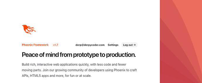
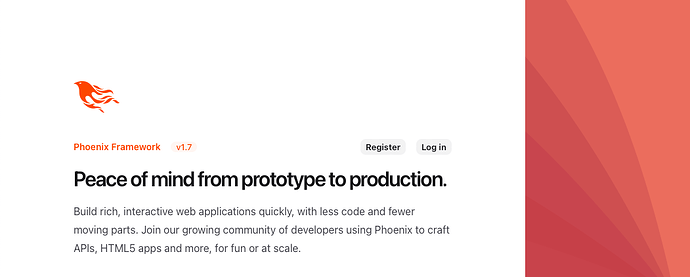
The Tailwind team also generously designed the new project landing page, CRUD pages, and authentication system pages for new projects, giving you a first-class and polished starting point for building out your apps.
A new phx.new project will contain a CoreComponents module, housing a core set of UI components like tables, modals, forms, and data lists. The suite of Phoenix generators (phx.gen.html|live|json|auth) make use of the core components. This has a number of neat advantages.
First, you can customize your core UI components to suit whatever needs, designs, and tastes that you have. If you want to use Bulma or Bootstrap instead of Tailwind – no problem! Simply replace the function definitions in core_components.ex with your framework/UI specific implementations and the generators continue to provide a great starting point for new features whether you’re a beginner, or seasoned expert building bespoke product features.
In practice, the generators give you templates that make use of your core components, which look like this:
<.header>
  New Post
  <:subtitle>Use this form to manage post records in your database.</:subtitle>
</.header>

<.simple_form :let={f} for={@changeset} action={~p"/posts"}>
  <.error :if={@changeset.action}>
    Oops, something went wrong! Please check the errors below.
  </.error>

  <input field={{f, :title}} type="text" label="Title" />
  <input field={{f, :views}} type="number" label="Views" />

  <:actions>
    <.button>Save Post</.button>
  </:actions>
</.simple_form>

<.back navigate={~p"/posts"}>Back to posts></.back>
We love what the Tailwind team designed for new applications, but we also can’t wait to see the community release their own drop-in replacements for core_components.ex for various frameworks of choice.
Unified function components across Controllers and LiveViews
Function components provided by HEEx, with declarative assigns and slots, are massive step-change in the way we write HTML in Phoenix projects. Function components provide UI building blocks, allowing features to be encapsulated and better extended over the previous template approach in Phoenix.View. You get a more natural way to write dynamic markup, reusable UI that can be extended by the caller, and compile-time features to make writing HTML-based applications a truly first-class experience.
Function components bring a new way to write HTML applications in Phoenix, with new sets of conventions. Additionally, users have struggled with how to marry controller-based Phoenix.View features with Phoenix.LiveView features in their applications. Users found themselves writing render("table", user: user) in controller-based templates, while their LiveViews made use of the new <.table rows={@users}> features. There was no great way to share the approaches in an application.
For these reasons, the Phoenix team unified the HTML rendering approaches whether from a controller request, or a LiveView. This shift also allowed us to revisit conventions and align with the LiveView approach of collocating templates and app code together.
New applications (and the phx generators), remove Phoenix.View as a dependency in favor of a new Phoenix.Template dependency, which uses function components as the basis for all rendering in the framework.
Your controllers still look the same:
defmodule AppWeb.UserController do
  use MyAppWeb, :controller

  def index(conn, _params) do
    users = ...
    render(conn, :index, users: users)
  end
end
But instead of the controller calling AppWeb.UserView.render("index.html", assigns), we’ll now first look for an index/1 function component on the view module, and call that for rendering if it exists. Additionally, we also renamed the inflected view module to look for AppWeb.UserHTML, or AppWeb.UserJSON, and so on for a view-per-format approach for rendering templates. This is all done in backwards compatible way, and is opt-in based on options to use Phoenix.Controller.
All HTML rendering is then based on function components, which can be written directly in a module, or embedded from an external file with the new embed_templates macro provided by Phoenix.Component. Your PageHTML module in a new application looks like this:
defmodule AppWeb.PageHTML do
  use AppWeb, :html

  embed_templates "page_html/*"
end
The new directory structure will look something like this:
lib/app_wb
├── controllers
│   ├── page_controller.ex
│   ├── page_html.ex
│   ├── error_html.ex
│   ├── error_json.ex
│   └── page_html
│       └── home.html.heex
├── live
│   ├── home_live.ex
├── components
│   ├── core_components.ex
│   ├── layouts.ex
│   └── layouts
│       ├── app.html.heex
│       └── root.html.heex
├── endpoint.ex
└── router.ex
Your controllers-based rendering or LiveView-based rendering now all share the same function components and layouts. Whether running phx.gen.html, phx.gen.live, or phx.gen.auth, the new generated templates all make use of your components/core_components.ex definitions.
Additionally, we have collocated the view modules next to their controller files. This brings the same benefits of LiveView collocation – highly coupled files live together. Files that must change together now live together, whether writing LiveView or controller features.
These changes were all about a better way to write HTML-based applications, but they also simplified rendering other formats, like JSON. For example, JSON based view modules follow the same conventions – Phoenix will first look for an index/1 function when rendering the index template, before trying render/2. This allowed us to simplify JSON rendering in general and do away with concepts like Phoenix.View.render_one|render_many.
For example, this is a JSON view generated by phx.gen.json:
defmodule AppWeb.PostJSON do
  alias AppWeb.Blog.Post

  @doc """
  Renders a list of posts.
  """
  def index(%{posts: posts}) do
    %{data: for(post <- posts, do: data(post))}
  end

  @doc """
  Renders a single post.
  """
  def show(%{post: post}) do
    %{data: data(post)}
  end

  defp data(%Post{} = post) do
    %{
      id: post.id,
      title: post.title
    }
  end
end
Notice how it’s all simply regular Elixir functions – as it should be!
These features provide a unified rendering model for applications going forward with a new and improved way to write UIs, but they are a deviation from previous practices. Most large, established applications are probably best served by continuing to depend on Phoenix.View.
Alternative Webserver Support
Thanks to work by Mat Trudel, we now have the basis for first-class webserver support in Plug and Phoenix, allowing other webservers like Bandit to be swapped in Phoenix while enjoying all features like WebSockets, Channels, and LiveView. Stay tuned to the Bandit project if you’re interested in a pure Elixir HTTP server or give it a try in your own Phoenix projects!
As always, step-by-step upgrade guides are there to take your existing 1.6.x apps up to 1.7.
The full changelog can be found here.
Find us on elixir slack or the forums if you have issues.
Happy coding!
–Chris


