Six months later our company’s storybook is now powered by phx_live_storybook.
We just looped the loop 
Six months later our company’s storybook is now powered by phx_live_storybook.
We just looped the loop
Finally got the time to add it to our project, we use Atomic design so it fits in pretty well.
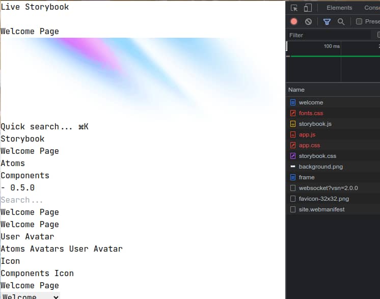
Got it it up and running pretty quickly, with the nice installer. But as soon as i added a component it exited on me, a few hours of debugging later i found the bug on github, turns out it didnt’ work with latest LiveView version. Then i tried to pull it down from the main branch, ran the installer again and while my component now shows, all the assets are now gone.
.
I think you need to run mix dev.storybook to get all the assets compiled in your deps folder (which is useless when you pull an official release)
Release is a bit late, but imminent 
Aaah that did the trick! Appreciate it, looking forward to 0.5. 
Hey there 
Release should have been released but obviously isn’t released yet 
Why that? Because of a little dependency imbroglio between phoenix_storybook and phoenix 1.7.0-rc2 not yet officially available. More details in the issue here
So let’s wait a few days, until official phoenix 1.7. get released, and then I’ll pull the trigger 
Thanks for the update @cblavier
I just published phoenix_storybook version 0.5.0 
Here is the changelog 
phx_live_storybook to phoenix_storybook. In your project:
phx_live_storybook to phoenix_storybookPhxLiveStorybook to PhoenixStorybookphoenix 1.7+@doc or your live_component @moduledoc comments.Congrats! Looking forward to upgrading my app to 1.7 & integrating this finally.
Might I suggest reaching out to one of the mods and changing the title of this thread? I think you’re well past the “interest check” stage of this project. 
Haha yes, and I can’t rename it myself 
Maybe should I start a new thread? The original storybook linked in the first post (which was the main inspiration for the current library) is now running on the new lib
Great work on the latest release.
I’ve just added storybook to a project of mine and one thing I was wondering during the setup is why everything is configured for production (routes, esbuild,…).
Is this by design?
For me I’d like to just enable storybook in development. I know how to make the necessary changes, but I’d wondered if this maybe shouldn’t be the default, or a choice offered?
Obviously I’m not the author but I feel this is the correct default in the spirit of open source and wouldn’t want it to change.
Thanks 
I received the same feedback from @josevalim a few months ago.
My take is that, by essence, a storybook is a tool to share and communicate about components and design. Not only for devs but for anyone in the project team.
But we should offer an option to disable it and make the storybook dev only. Feel free to open an issue!
I agree. We deploy the storybook to production (behind authentication), so that our designers and any stakeholders can easily check the components we build. There are also a lot of organizations that choose to make their design systems and (non-phoenix) storybooks public.
Just so impressed with what I see. Such an effort, such a result! Having a storybook-system is a requirement within some companies so this helps with adoptation of Phoenix (and Elixir).
Keep up the good work.
Definitely! At my last company a design came in and was a bit shocked that they couldn’t use (React) Storybook. This project removes that argument against adopting Phoenix!
I’ve simply put it behind a env check in my router, seems to work fine for me.
  if Application.compile_env!(:app, :environment) != :prod do
    live_storybook("/dev/storybook", backend_module: GIWeb.Storybook)
    ...
Sure, but you’re still compiling all the assets as well. In production, I’d rather not have them.
I think the fix is easy enough. Instead of configuring storybook in config.exs, do it in dev.exs. I think some other things my need to be changed as well, but I think it should be possible.
This is very slick, it was really painless to integrate to an existing project!
One thing is that my website is a dark theme and the components looks really out of place in the light background of storybook.
I’ve tried this but it doesn’t seem to work in storybook.css
/* This is your custom storybook stylesheet. */
@import "tailwindcss/base";
@import "tailwindcss/components";
@import "tailwindcss/utilities";

/*
 * Put your component styling within the Tailwind utilities layer.
 * See the https://hexdocs.pm/phoenix_storybook/sandboxing.html guide for more info.
 */
@layer utilities {
  * {
    font-family: ui-sans-serif, system-ui;
  }

  .lsb-variation-block {
    @apply bg-gray-900 text-gray-100;
  }
}
Is there a way to change the default background color across the board for storybook?
It’s been a while since I last posted here, but the storybook project is still alive and being maintained
I just published 0.5.7.
I don’t have enough time to contribute to new features, but still doing my best to keep up with elixir & phoenix new releases and helping folks to use it!
No solution yet!
But I will look into it for the next release


© Copyright Elixir Forum | Terms | Privacy & Cookies