If you’re using a different css file, ofcourse you need to compile it as well with assets.deploy:
"assets.deploy": ["tailwind default --minify", "tailwind storybook --minify", "esbuild default --minify", "phx.digest"],
1 Like
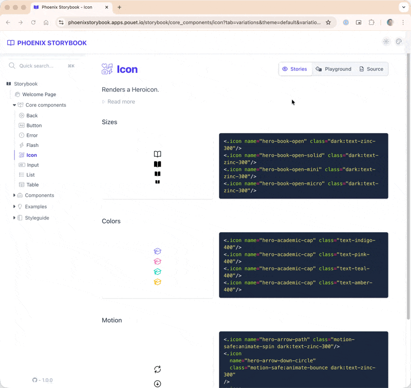
Released 0.7.2 with support for local_icons plus color_mode & icon related bugfixes
- feature: support for local icons (read the updated
icons.mdguide for details) - bugfix: fixed missing color mode icons
- bugfix: fixed active dark mode when color_mode is disabled
- change (breaking!): FontAwesome icons are now CSS loaded (cf.
icons.mdguide)
1 Like
Rendering the source code for a full component module could be too lengthy and slow (think core_components.ex with a lot of function components in a single module)
You can now decide, per story, to render only your function’s source code.
Shipped, but not released yet.
Released 0.8.0 with a lot of stuff regarding components, attributes, and slots documentation 
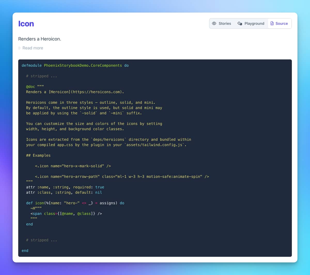
Function documentation is properly rendering markdown:
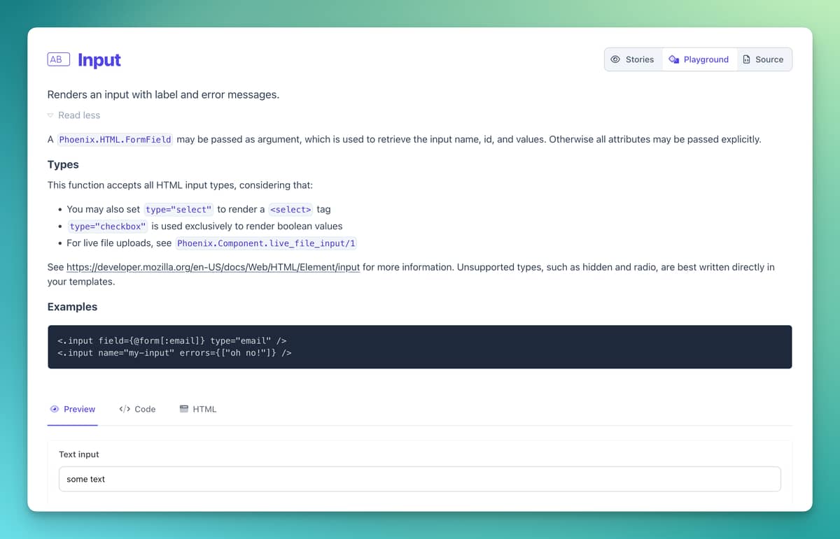
Attribute and slots documentation is rendering markdown and can be expanded when written on multiple lines.
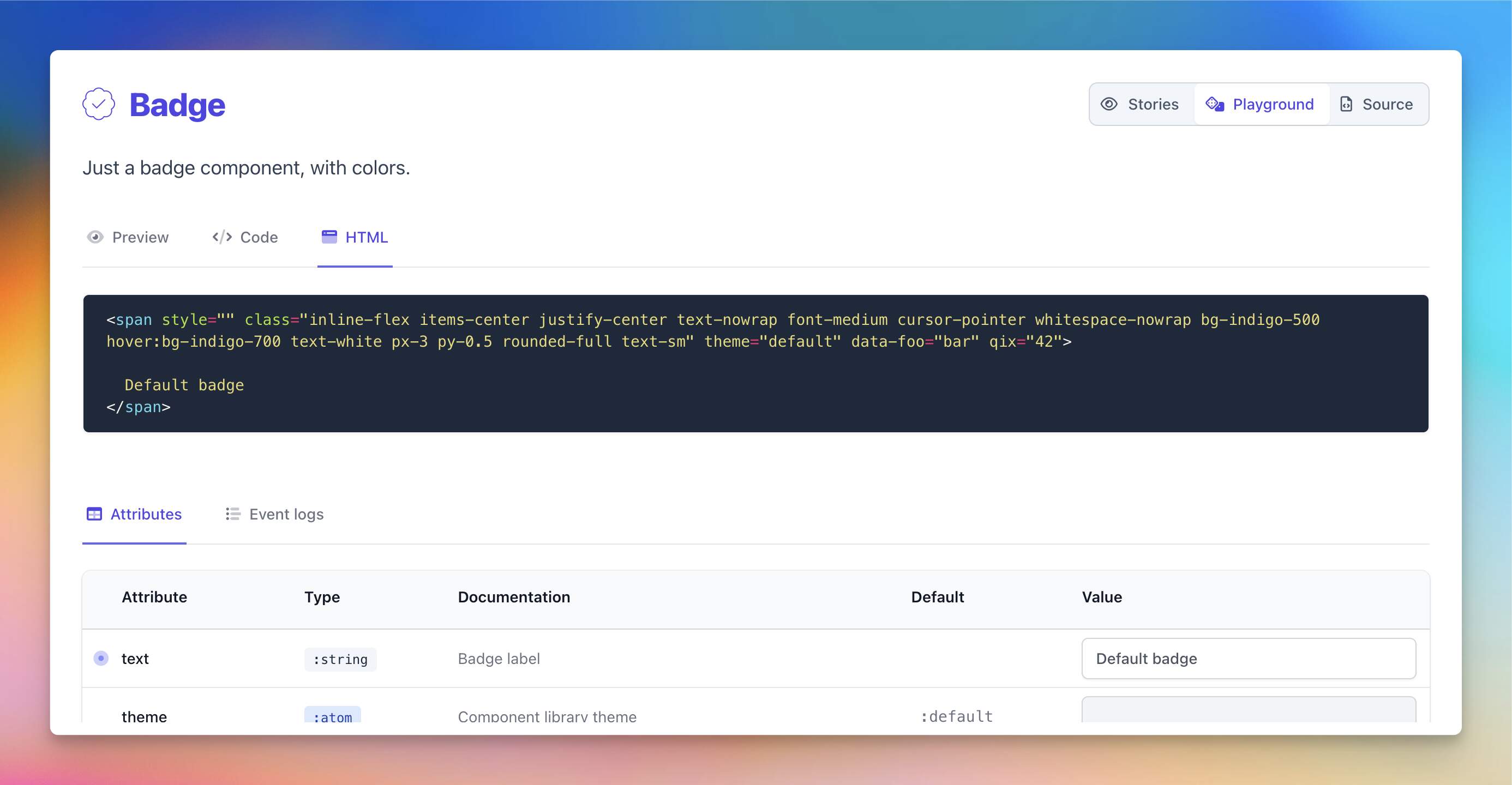
It also features a new HTML preview tab for function components
 it now requires
 phoenix_live_view 1.0.0
Full changelog 👇
- change (breaking!): requires
phoenix_live_view ~> 1.0.x - feature: new tab to preview function components HTML
- improvement: component documentation’s markdown is properly formatted
- improvement: component documentation’s attribute stripping can be opted out by configuration
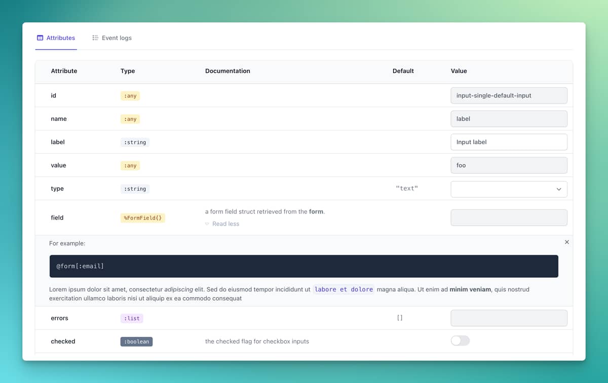
- improvement: playground attribute documentation is properly formatted and can be expanded
when written on multiple lines. - improvement: nested slot attributes are properly displayed in the playground
- improvement: render only component function’s source code for component stories
- improvement: updated generator with improved core_components’ stories
- improvement: generated code markup is properly wrapped
- improvement: storybook can be disabled per environment
- bugfix: fixed broken playground for stories using templating features
5 Likes
0.8.1 is out, this is the first release ever for which I didn’t produce a single line of code.
Thank you @xxdavid @cschmatzler @sodapopcan for your contributions! 
Changelog:
- improvement: better formatting of playground’s HTML - @xxdavid
- improvement: highlight code blocks in components doc - @xxdavid
- improvement: support ESM imports for scripts - @cschmatzler
- improvement: UX tweaks - @sodapopcan
11 Likes
 It’s been a few months!
Version 0.9.0 (and 0.9.1) have just been released. Most of the work focused on migrating to Tailwind 4.x, which turned out to be quite a daunting task! 
Here the changelog:
v0.9.1 (2025-07-04)
- bugfix: asset finger-printing is now an opt-in config var (see README)
v0.9.0 (2025-07-04)
- change:
phoenix_storybookhas been considerably refactored to use the latest Tailwind 4.x. - bugfix:
phoenix&phoenix_live_vieware no longer bundled in the storybook JS file - bugfix: JSS and CSS assets are served with their MD5 fingerprint
- bugfix: color mode is propagated to example stories
- bugfix: fixed warnings when generating mix docs
6 Likes
I am working on a component that optionally has a row_click attribute.
How can I pass the value of the row_click attribute (which is JS event) in my functional component for my story to be shown?
I got it working now,
 attributes: %{
          ...
          row_click:
            {:eval,
             ~S"""
             fn id ->
             %JS{}
             |> JS.toggle_class( "rotate-180", to: "#icon-user-with-accordion-#{id}")
             |> JS.toggle_class("hidden", to: "#content-user-with-accordion-#{id}")
             end
             """}
        },
1 Like
 0.9.2 has been released!
- feature: sidebar entries can be sorted (read
Indexmodule doc for details) - improvement: fingerprinting of user assets
- change: updated generator with correct otp_app and updated tailwind instructions
- bugfix: performance impact of event logs
- bugfix: events in the playground couldn’t be unfolded
- bugfix: the storybook JS bundle wasn’t loaded within iframes
- bugfix: anchor icon should appear on hover
- bugfix: iframe.js loads before storybook.js when using the module js type
And a big question: when is it a good time to release a 1.0.0? 
4 Likes
Why a 1.0.0 now?
… because why not? 
We’ve been using it in production for years, so it feels stable enough!
The changelog:
- feature: support custom light class in color mode sandbox
- feature: allow live_component stories to implement
handle_info/2for parent message handling (e.g.send_update/2) - improvement: allow overriding FontAwesome CSS path to use app-provided assets
- bugfix: storybook asset hash query param renamed to avoid live reload URL rewriting
- bugfix: Error when using hooks defined as a subclass of LiveView’s v1.1 new ViewHook
4 Likes
I just shipped support for permalinks to a component’s source on GitHub and GitLab.
The link includes precise highlighting of the component’s function. 
 Bonus: dedicated icons for GitHub and GitLab.
Now on main, soon in 1.1.0
3 Likes


