Tucan - a plotting library on top of VegaLite

Tucan is an Elixir plotting library built on top of VegaLite designed to simplify the creation of interactive and visually stunning plots. With Tucan you can effortlessly generate a wide range of plots, from simple bar charts to complex composite plots, all while enjoying the power and flexibility of a clean composable functional API. Version 0.1.1 was just released :tada:

You can find the docs here.

Sample usage:

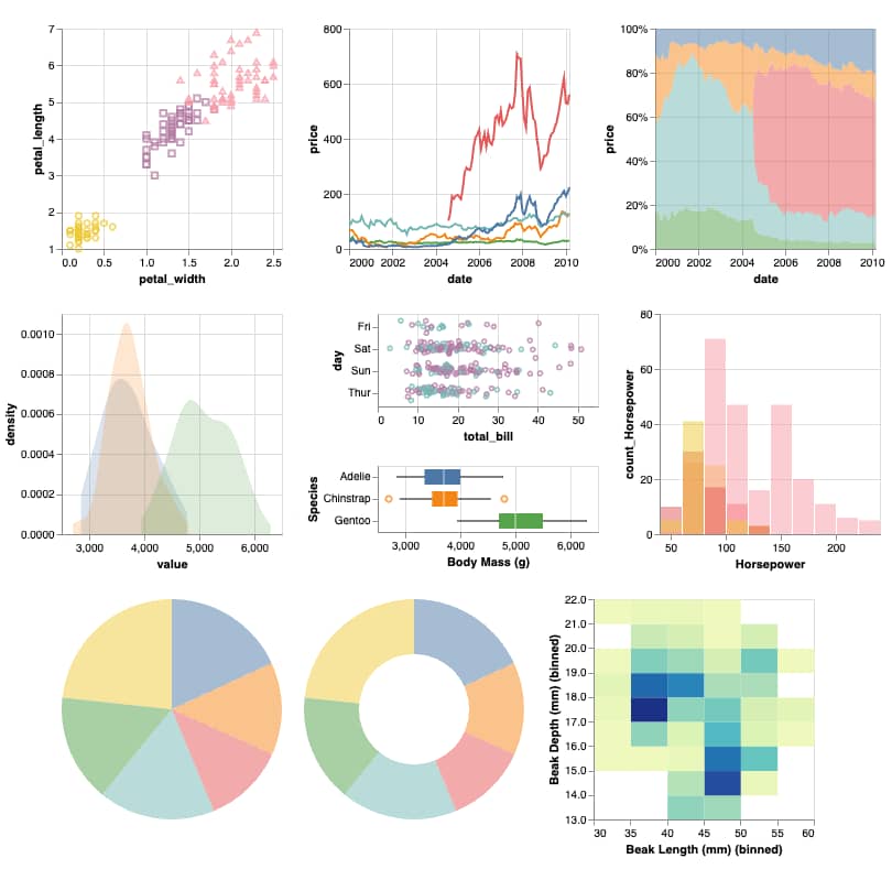
scatter =
  Tucan.scatter(:iris, "petal_width", "petal_length", tooltip: true)
  |> Tucan.color_by("species")
  |> Tucan.shape_by("species")

lines = Tucan.lineplot(:stocks, "date", "price", color_by: "symbol", x: [type: :temporal])

area =
  Tucan.area(:stocks, "date", "price", color_by: "symbol", mode: :normalize, x: [type: :temporal])

density = Tucan.density(:penguins, "Body Mass (g)", color_by: "Species", fill_opacity: 0.2)

strip =
  Tucan.stripplot(:tips, "total_bill", group: "day", style: :jitter)
  |> Tucan.color_by("sex")

boxplot = Tucan.boxplot(:penguins, "Body Mass (g)", color_by: "Species")
histogram = Tucan.histogram(:cars, "Horsepower", color_by: "Origin", fill_opacity: 0.5)

pie = Tucan.pie(:barley, "yield", "site", aggregate: :sum, tooltip: true)

donut = Tucan.donut(:barley, "yield", "site", aggregate: :sum, tooltip: true)

heatmap =
  Tucan.density_heatmap(:penguins, "Beak Length (mm)", "Beak Depth (mm)", fill_opacity: 1.0)

Tucan.vconcat([
  Tucan.hconcat([scatter, lines, area]),
  Tucan.hconcat([density, Tucan.vconcat([strip, boxplot]), histogram]),
  Tucan.hconcat([pie, donut, heatmap])
])

will generate the following:

Credits go to @jonatanklosko for the awesome VegaLite bindings.
36 Likes

Hey this is looks great!

I’ve been playing with VegaLite recently. I have a Matplotlib background and I think because of that I found the new API a little confusing. I’ll give this a try!

2 Likes

Hey @billylanchantin that was the main reason i implemented it. I have also a seaborn/matplotlib background and the learning curve of VegaLite was steep.

2 Likes

@pnezis this is amazing and charts in the docs are absolute fire!! :cat2: :fire:

5 Likes

Amazing! :fire:

1 Like

Very cool! Any plans for live/dynamically updated charts? It’s the part of VegaLite that made me struggle the most.

1 Like

@jonatanklosko thanks!

The charts are auto-generated from plain markdown code blocks. A custom markdown processor is used that compiles the block, formats it and renders both the original code block and the vega lite spec.

The underlying package originated from a discussion with @josevalim in the ex_doc repo some time ago.

2 Likes

Hi! dynamically updated charts as well as a high level API for interactive charts is in the plans for future releases.

4 Likes

@pnezis would you also support heatmaps? My understanding is that they are similar to your current density heatmap, except there is no binning on X and no aggregate on Y. :slight_smile: (X may also need to be nominal).

@josevalim correct heatmaps are very similar to denisty heatmaps, but for categorical variables on both axes (ordinal or nominal in vegalite terminology) instead of numerical.

I guess I missed it, will definitely add it.

2 Likes

@josevalim heatmap/5 added :slight_smile: Will release a new version later this week

5 Likes

amazing work! :rocket:

1 Like

New version released today: v0.2.0, with many new features:

  • heatmap, punchcard and jointplot plots
  • vruler and hruler for adding vertical/horizontal rulers on any plot
  • Helper modules for configuring the Legend and the Scale
  • Docs improvements, added a livebook guide

You can find the full CHANGELOG here

Any feedback welcome

11 Likes

The new (and old) plots are great!

7 Likes

:tada: v0.3.0 is out. It includes many new features and enhancements:

  • Nx support, you can pass directly tensors as series to all plots
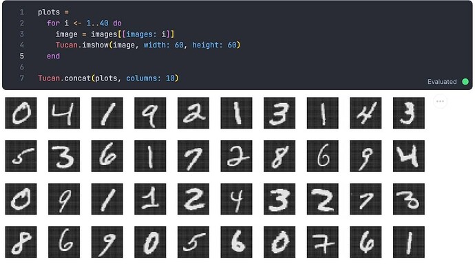
  • imshow allows you to plot pseudo-color images
  • errorbar and errorband plots added
  • lollipop plot added as an alternative to bar chart
  • Tucan.Geometry module provides an API for plotting common geometric shapes and polylines

You can find the full CHANGELOG here

Happy new year!

6 Likes

I am trying to change the color of the bar graph that is beside the default blue. I am looking at the :color encoding but I am unsure how that works. Can someone give me an example code of how that works? I wanna use hexcodes.

This is currently not supported, I will add it the new release, for now you can do:

data = [
  %{"a" => "A", "b" => 28},
  %{"a" => "B", "b" => 55},
  ...
]

plot = Tucan.bar(data, "a", "b", color: [datum: "red"])

%VegaLite{
  plot
  | spec: update_in(plot.spec, ["mark"], fn opts -> Map.merge(opts, %{"color" => "#fa1243"}) end)
}

PS. Fix pushed, you can now use fill_color: your_hex_here in the bar chart. You need to add it as git dependency for now.

So it would be tucan.bar(data,β€œa”,β€œb”,fill_color: hex_value)??

So it would be tucan.bar(data,β€œa”,β€œb”,fill_color: hex_value)??

Correct

Can you show what I add as a git dependency?