
cortfritz
Would the Phoenix maintainers - and the community - welcome a PR adding dark mode with selectors consistently to all phx gen templates?
Each time i use phx.gen I end up adding dark mode to it.
I’m offering to add this to the default phx gen templates.
This would
- use tailwind
- add new tailwind customization into tailwind.config.js? or wherever you prefer.
- update core_components and each template
- put a toggle affordance in the nav
- default to local preference
- set toggle state in browser session, overriding preference
- leave the main phx home page alone
- happy to also pick up any existing template bugs since i’m in there already - e.g. index page table row hover bg color right column inconsistent height.
I hope you:
- find this proposal considerate!
- …clear
- …worth considering - dark mode feels like a nice default thing to add.
I’ve seen dark mode “how do i” threads in this forum but do not see a proposal to implement. I think LLM agents make this pretty cheap - that’s how i do it each time i start a new project and this feels like it would be similar to one of my one offs but just more extensive and more carefully tested.
I’m open to working with others but happy to just do this myself.
Most Liked

chrismccord

cblavier
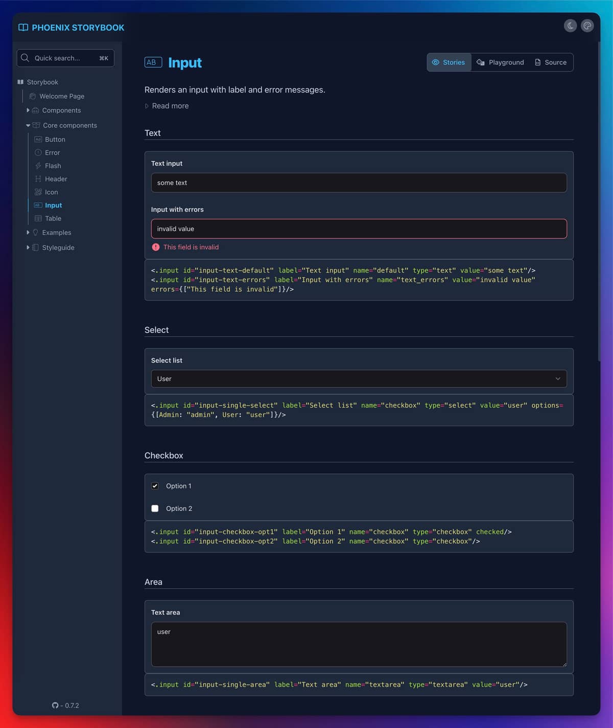
 Here is the
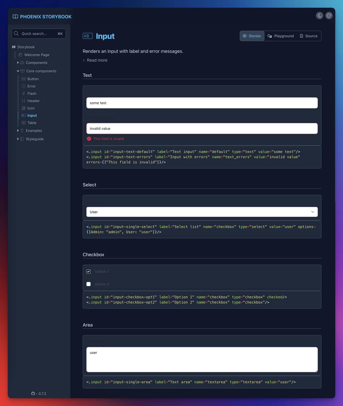

sodapopcan
I’m not sure why anyone wouldn’t be happy with this  I’m not on or close to the Phoenix team but I’m guessing this is one of those non-pressing issues that is merely waiting for someone like you to come along. Just a guess, though! A big plus one from me, and I’m not even a dark mode user.
Popular in Proposals: Ideas


Other popular topics


 Latest Phoenix Threads
Latest on Elixir Forum
Sponsor Spotlight

Build Elixir applications with speed and confidence.
Categories:
Sub Categories:
Forums
Popular Tags
- #ecto
- #liveview
- #troubleshooting
- #learning-elixir
- #deployment
- #library
- #erlang
- #testing
- #genserver
- #mix
- #absinthe
- #remote-other
- #otp
- #plug
- #how-to-question
- #macros
- #postgres
- #channels
- #elixirconf
- #exunit
- #discussion
- #code-sync
- #javascript
- #podcasts
- #onsite
- #dialyzer
- #docker
- #authentication
- #umbrella
- #full-time-contract
- #podcasts-by-brainlid
- #ecto-query
- #elixir-ls
- #phoenix_html
- #iex
- #blog-post
- #graphql
- #genstage
- #ai
- #websockets
- #supervisor
- #advent-of-code
- #elixirconf-us
- #distillery
- #processes
- #forms
- #api
- #metaprogramming
- #security
- #hex
Our Sponsors
Build Elixir applications with speed and confidence.

Supporting innovation across the BEAM ecosystem.

We build reliable cloud platforms for business-critical systems.

Catch errors, track performance, monitor hosts and more.

Error tracking for Elixir devs who love to ship. Start your free account.

Practical resources that improve the lives of professional developers.

Develop your skills with books, videos, and courses.

Enabling companies to succeed by building software people love.

The team behind Membrane, Popcorn, LiveDebugger. Available for hire.

Courses that'll move you from confusion to "Aha, now I get it!"