Just released 0.1.0 
11 Likes
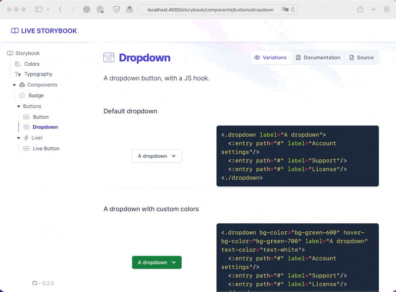
Now on track for 0.2.0 

Last features:
- copy/paste code snippets
- component sub-navigation
- preview your component source code
11 Likes
Today I shipped the ability to mix regular page entries within your storybook content.
We found it useful to share some general UI guidelines with the team.

9 Likes
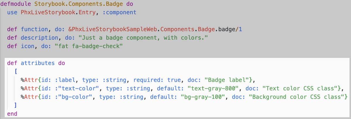
After a lot of technical code and refactoring (btw I still need help on this topic), I just started working on a pillar feature of the storybook: component documentation & playground.
It will list and document all your component’s properties, and allow you to play with them interactively.
I wrote an attributes API that mimics forthcoming LiveView 0.18.0 declarative assigns
Stay tuned 
4 Likes
This is cool! We are slowly migrating over to a more component based structure for our liveview project.
Thanks for you effort, will give it a go soonish.
1 Like
Cool! Feel free to give some feedbacks after you tried it.
If you are still building your components library, make sure to have a look at our other library, it helped us a lot.
4 Likes
This came at the right time for us, as I was planning to dump all our components on a blank page to aid our designer as we start our topdown redesign with Phoenix Components next week. Now we have this set up for our atomic components. We’re very excited to see how this progresses.
1 Like
A couple of days later, the new playground tab (inspired by what @msaraiva did on Surface Catalogue) is shaping up!

9 Likes
I just went through a bit of refactoring to compartmentalize component playground rendering in a dedicated child LiveView.
Below is an example where a component crashes, because of a missing required attribute.
I’m always amazed by seeing the crashed LiveView restart & recover by itself, with 0 lines of code.

In a further release, it will also help with a real-time state inspection feature.
11 Likes
Looking awesome!
2 Likes
Hey guys, I just released 0.3.0 which is quite a big one
 Demo is still available here.
Here is the changelog:
-
change (breaking!): entries must now be written as
.exsfiles. Otherwise, they will be ignored. -
change (breaking!):
variationshave been rebranded asstories. -
change (breaking!):
live_storybook/2must be set in yourrouter.exoutside your main scope
and outside your:browserpipeline. - feature: new Playground tab to play with your components! To use it, you must declare attributes in your component entries.
-
feature: you can opt-in iframe rendering for any of your components with
def container, do: :iframe - improvement: storybook is now fully responsive.
- improvement: meaningful errors are raised during compilation if your entries are invalid.
- improvement: improved storybook CSS isolation. It should no longer leak within your components.
-
improvement: stateless component entries no longer require defining a
component/0function. -
documentation: new
sandboxing.mdguide.
Big thanks to @glennr, @LostKobrakai and @seb3s for their contribution 
13 Likes
Just shipped on the storybook this very morning.
Support for custom component themes 

Responsive component playground

8 Likes
Big kudos to @matthieuchabert who just shipped an awesome cmd K search feature to phx_live_storybook!

8 Likes
Hey there, just a small update.
Still working toward a 0.4.0 release in a few weeks from now, and I’m pretty excited that some under-work features will come from external contributors (poke @dgigafox)
In recent work, we made it possible to open the component playground from any story.
If it’s a story group you can even bulk edit components.

12 Likes
After a huge step of refactoring, 0.4.0 is around the corner.
To wait until then, here is a sneak peek of the playground event log crafted by @dgigafox

14 Likes
Hey there, we just released 0.4.0 of phx_live_storybook
A lot of work was involved in shipping new features, fixing bugs, refactoring code, and integrating feedback from both @josevalim & @chrismccord . Thanks also to @matthieuchabert @dgigafox @seb3s for your contributions 
If you already used a prior version of the lib, please read the changelog, it’s huge
If you’re a newcomer, then mix phx.gen.storybook is your friend!
18 Likes
Hey there, nothing really new on the project (even if a few minor versions have been released since 0.4.0), but I just recorded a getting started video on using phx_live_storybook
7 Likes
It’s been a while since I last posted here.
0.5.0 is under work with a few new features and improvements. Among the latest shipped is the support for example stories:
We will now improve the storybook generator to generate stories and examples based on the new Phoenix 1.7 core components.
13 Likes


