
charlenopires
PhiaUI - UI component library for Phoenix LiveView
Hi everyone 
I’ve been working on PhiaUI, an open-source UI component library for Phoenix LiveView, and I wanted to share it with the community.
The project is still evolving, but it already includes 534 components and a growing ecosystem of demos and documentation.
What is PhiaUI?
PhiaUI is a shadcn/ui-inspired component library built specifically for Phoenix LiveView, focusing on composable HEEx components, minimal JS, and full integration with the Phoenix ecosystem.
The design philosophy is:
-
Stateless HEEx function components
-
Zero heavy JS dependencies
-
Full Phoenix / LiveView integration
-
Ejectable components (you own the code)
-
TailwindCSS-first design
-
Accessibility (WAI-ARIA support)
-
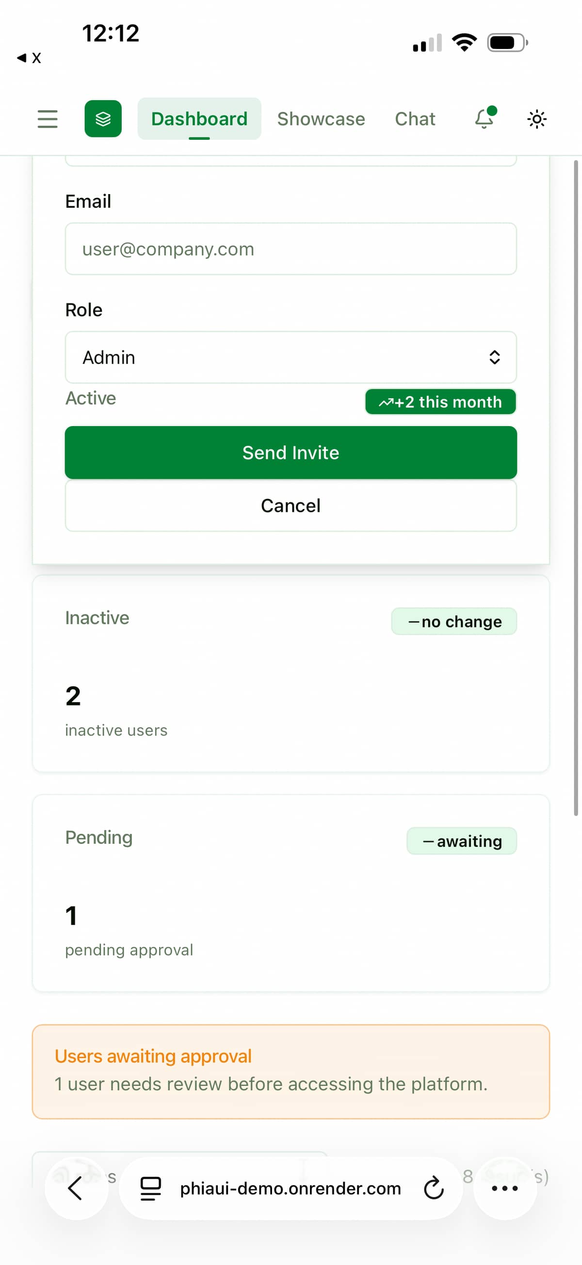
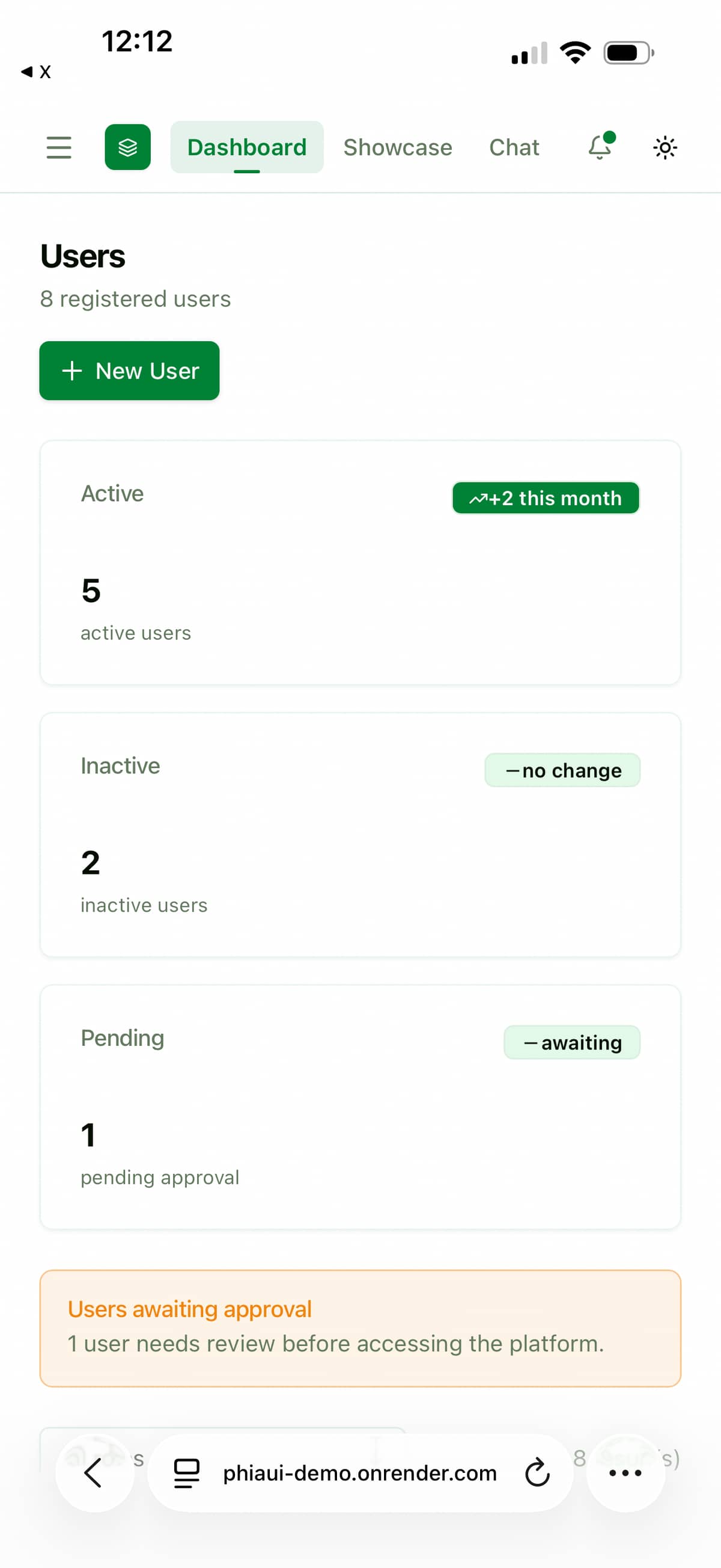
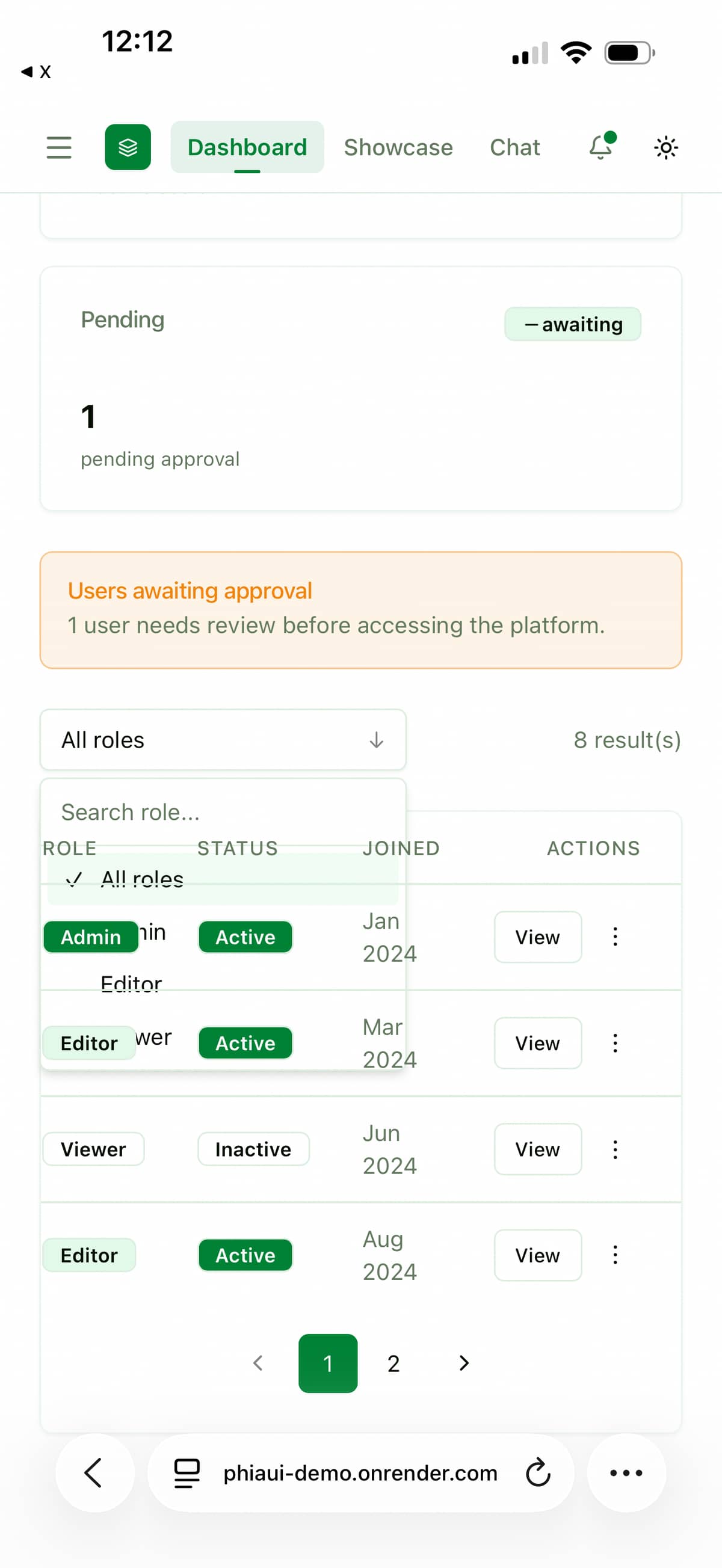
Enterprise-ready dashboard widgets
Interactive components use LiveView JS commands or lightweight hooks, avoiding frameworks like Alpine or React whenever possible.
 Component coverage
The library includes components across many categories such as:
-
Forms & Inputs
-
Data tables and grids
-
Navigation
-
Dialogs / overlays
-
Dashboard shells
-
Analytics widgets
-
Enterprise UI patterns
Examples include:
-
rich text editor
-
kanban boards
-
activity feeds
-
command palette
-
dashboard KPI widgets
-
filters and bulk action bars
-
date pickers and calendars
-
charts wrappers
-
advanced form components
 Live Demo
You can explore a live demo here:
Demo
 16 Phoenix LiveView demo apps
To demonstrate real-world usage, I also built 16 complete Phoenix LiveView demo applications using the library:
GitHub examples
https://github.com/charlenopires/PhiaUI-samples
These apps demonstrate patterns like:
-
dashboards
-
CMS interfaces
-
data management tools
-
complex forms
-
analytics interfaces
 Documentation
Full documentation:
Installation is simple:
# mix.exs
def deps do
  [
    {:phia_ui, "~> 0.1.12"}
  ]
end
 Feedback and contributions
The project is still in active development, so feedback, issues, ideas, and contributions are very welcome.
Things I’m particularly interested in:
- developer experience improvements
- component API feedback
- accessibility improvements
- performance optimizations
- new component ideas
If you’re building Phoenix LiveView apps and want a large UI component toolbox , I’d love to hear your thoughts.
 Repo feedback and issues are greatly appreciated.
Most Liked

Neophen
You’re absolutely right!
This is the definition of Ai slop, i didn’t wven need to have a look at the code to see multitudes of bugs.
The author also replies with AI generated replies, which just feels like he copy pasted the comment and asked for a reply.
i would stay away from this. This is someone who won’t even review their code. Just use daisy ui or one of the multitude of ui libs for phoenix that actually walked through the code and paid attention to actual usability and quality of code

charlenopires
Hi! I’d like to clarify a few things.
First, I don’t speak English fluently, so I use AI to help generate my responses here on the forum. I can read and understand most messages, but writing detailed replies in English is difficult for me, so AI helps me communicate better.
About the library: everyone is free to use whatever tools or UI libraries they prefer. In my case, I will continue developing this library because the goal is personal. I’m building it mainly to use in my own production projects.
The reason for creating a large number of visual components is simple: I don’t want to depend on 3–4 different UI libraries in the same project. My goal is to concentrate everything in one customizable library that covers most interface needs.
My philosophy is also simple: launch first, then improve. If we wait for everything to be perfect before releasing something, nothing ever gets released. So I prefer to put things out, gather feedback, and then iterate and refine the code over time.
I initially created the library using a vibe coding approach. Now I’m entering the next phase: carefully reviewing, analyzing, and refactoring the code. In my opinion, the world is moving toward vibe coding, and trying to ignore that reality doesn’t make much sense. I’m actually grateful to live in this moment because it allows us to move with much more speed.
Before using vibe coding heavily, I built the foundation myself: the first components, the skills, and the sub-agents. This was important so I could properly explain the architecture and provide good context to the AI.
My setup also includes a structured memory and context system:
- Neo4j with HyperGraph for knowledge graphs + semantic memory
- Vector embeddings via Ollama + Qdrant for intelligent context recall
This helps maintain consistent context so the components remain uniform and behave in the same way across the library.
Finally, thank you for the feedback and for the screenshots. They were very helpful and I already know several areas where I can improve.
And of course, if you’re interested, you’re very welcome to contribute to the project. Feedback, issues, suggestions, or pull requests are all appreciated. Collaboration is always welcome!
https://github.com/charlenopires/PhiaUI

vicb335
2 things, gave it a quick look on mobile, most components have their css in some way broken and your GitHub links in the docs points to a non-existent phiaui/phia_ui repo.
The amount of components seems quite large and I see that Claude helped quite a bit (found the actual repo). Just be careful to not generate more than you can manage, good luck and always nice to have more UI toolkits specially with little JS!
Popular in Announcing


Other popular topics


 Latest Phoenix Threads
Latest on Elixir Forum
Sponsor Spotlight

Build Elixir applications with speed and confidence.
Categories:
Sub Categories:
Forums
Popular Tags
- #ecto
- #liveview
- #troubleshooting
- #learning-elixir
- #deployment
- #library
- #erlang
- #testing
- #genserver
- #mix
- #absinthe
- #remote-other
- #otp
- #plug
- #how-to-question
- #macros
- #postgres
- #channels
- #elixirconf
- #exunit
- #discussion
- #code-sync
- #javascript
- #podcasts
- #onsite
- #dialyzer
- #docker
- #authentication
- #umbrella
- #full-time-contract
- #podcasts-by-brainlid
- #ecto-query
- #elixir-ls
- #phoenix_html
- #iex
- #blog-post
- #graphql
- #genstage
- #ai
- #websockets
- #supervisor
- #advent-of-code
- #elixirconf-us
- #distillery
- #processes
- #forms
- #api
- #metaprogramming
- #security
- #hex
Our Sponsors
Build Elixir applications with speed and confidence.

Supporting innovation across the BEAM ecosystem.

We build reliable cloud platforms for business-critical systems.

Catch errors, track performance, monitor hosts and more.

Error tracking for Elixir devs who love to ship. Start your free account.

Practical resources that improve the lives of professional developers.

Develop your skills with books, videos, and courses.

Enabling companies to succeed by building software people love.

The team behind Membrane, Popcorn, LiveDebugger. Available for hire.

Courses that'll move you from confusion to "Aha, now I get it!"